How to Create Better Charts to Show Fundraising Results

In this post, you’ll learn from my mistakes and create better charts for your audience – to show fundraising results, organization’s impact or benchmarking.
Have you seen a chart and asked yourself, “What is this? What am I supposed to learn from this?”
You’re not alone. Are we guilty of creating such charts ourselves?
I will let you decide. Here’s a chart from my thesis I created about 15 years ago.
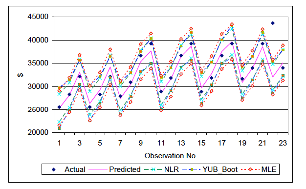
Whatttt??????
Here are a few things you should think about while creating charts:
- Shape
- Color
- Clarity
- Accessibility
Let’s look at each of them.
Shape
While creating new graphs, you should first think about the shape or the chart type you want to use. Some typical shapes we use to encode data are: rectangle, lines, or circles.
Different shapes or chart types have their uses. But, misusing them can create confusion or mislead the reader.
Rectangle
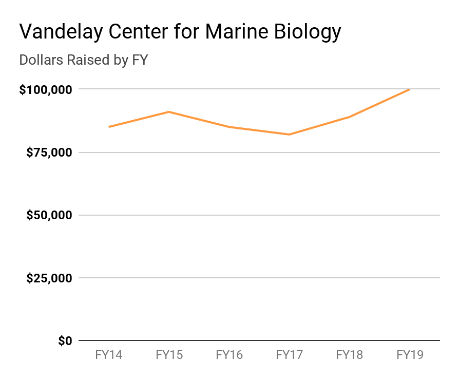
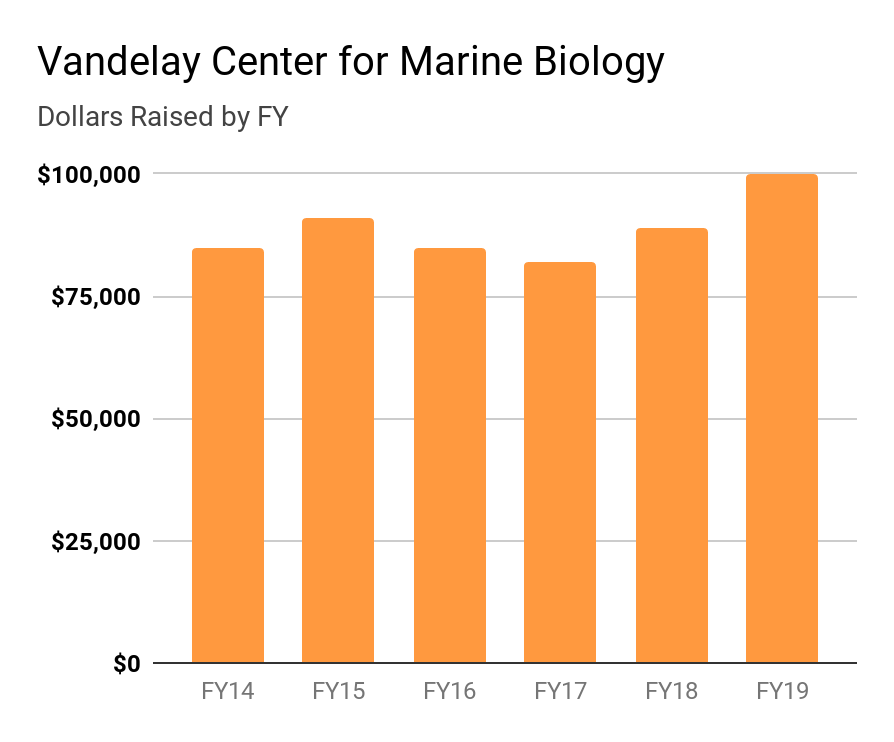
We can encode any data by turning the measured value to an appropriate length. For example, in the following chart, we can say that the Vandelay Center for Marine Biology raised $100,000 in FY19. The rectangle encodes $100,000 with its length.
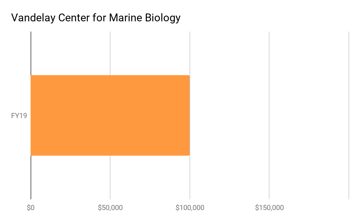
We can change the shape of this rectangle by extending the height or squeezing the width. We can also change its orientation. We can also remove the fill and just leave a marker at the end, as shown in the charts below.
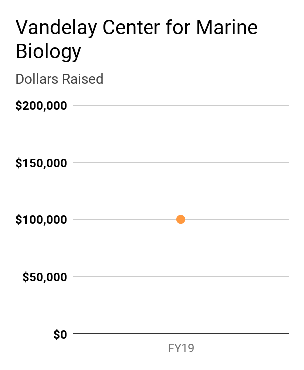
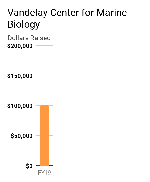
Let’s say you want to show year-over-year fundraising results for the Vandelay center. Which shape would you choose?
If it is truly a trend over time you want to show, you should choose a line chart. Notice how you can see the dips and rises more clearly in the line chart compared to the bar chart.
Those changes are even more evident when you adjust the y-axis starting point.
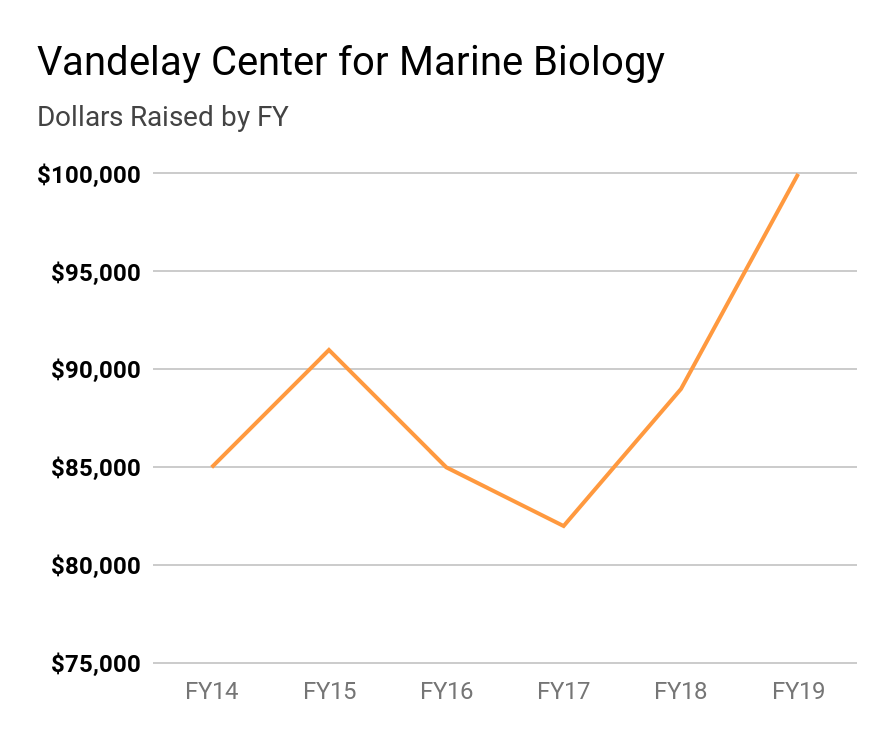
You could argue that you could do the same thing with a bar chart. But there are very good reasons not to do so. There’s a greater risk of misleading the readers when you start the axis at a random point — the whole point of the bar is that its height or length encodes the metric.
Circle
Circle charts are often used these two ways:
- a) the size of a circle denotes a metric, and
- b) a circle is divided into “slices” to encode different metrics.
Some argue that the biggest challenge with the circle charts is our inability to precisely measure circular shapes and angles. Remember: the chart encodes the data, but the readers have to decode them.
There are benefits of using circles because you can compare the differences in magnitude by comparing the sizes of the circles.
For example, let’s say that we know that the Vandelay center raised $26,000, $19,000, and $5,000 for Sharks, Whales, and Turtles respectively. You could encode this metric as the size of the circle as shown below. It is evident that the center raised more money for Sharks than Whales. And the smallest circle, which you can’t see clearly, brought the least amount of money.
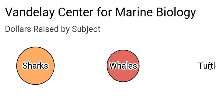
That’s great, but even if were to show a legend with a relative size of a circle, you’d have a difficult time precisely calculating the money raised by each animal.
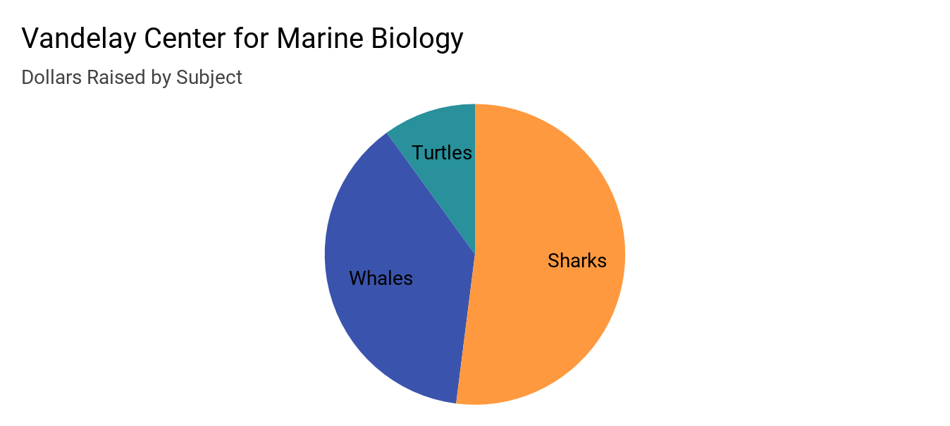
What if you wanted to show the proportion of fundraising by each animal. This is where pie charts excel. Pie charts show the part-to-whole proportion well. For example, in the chart below, you can see Sharks brought more than 50% of the fundraising.
But there’s a saying in Marathi, my native language, “ati tithe maati,” meaning too much of anything leads to less-usefulness (or waste).
And a good useful pie chart is rendered useless by adding multiple indistinguishable slices. We may try correct the problem by adding text labels, but why not just show the proportions in a more precise table.
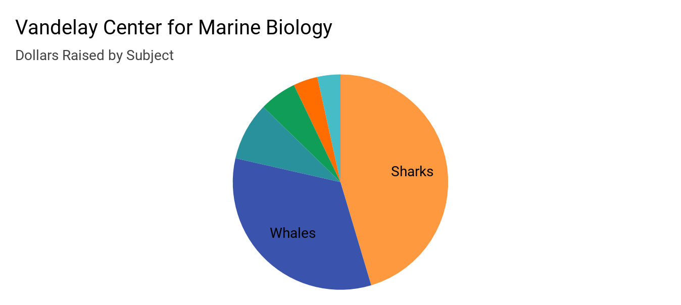
| Subject | Dollars Raised | % of Total |
| Sharks | $26,000 | 45.39% |
| Whales | $19,000 | 33.17% |
| Turtles | $5,000 | 8.73% |
| Jellyfish | $3,200 | 5.59% |
| Starfish | $2,100 | 3.67% |
| Corals | $1,980 | 3.46% |
| Total | $57,280 | 100.00% |
Color
Good looking charts have good looking colors, but sometimes effective charts lack multiple colors.
There are two competing principles at play here:
- a) if you can’t get your reader interested, your chart or analysis is wasted.
- b) if you use too many colors, the reader will leave with little or no understanding.
So what should one do?
Use minimum amounts of color to make your chart appealing as well as to differentiate the data points. Often, you can use colors to highlight a trend or data point. If you need to rely on multiple colors to differentiate your data points, you should redesign your chart. A confusing chart is a sign of minimal time invested by its designer.
Let’s see a couple of examples.
We want to compare the fundraising of two fiscal years by subject. Here’s one approach with the data grouped by fiscal years and each subject gets its own color.
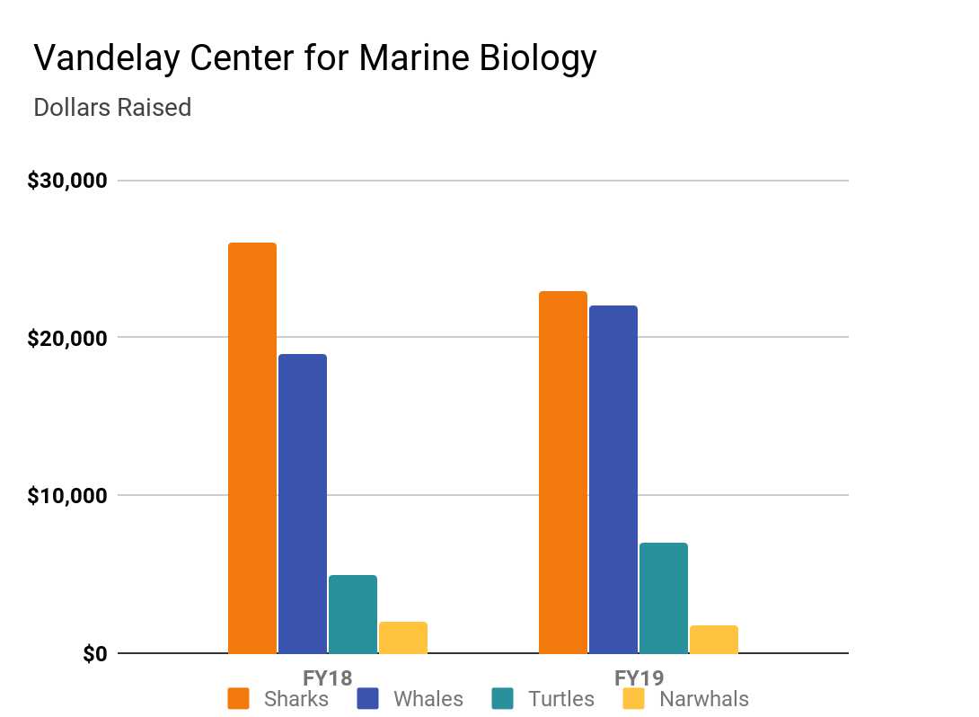
Now, this chart isn’t bad and does its job. But think of the steps you have taken to decode the chart:
- first look at the color of a subject
- find the same color in both fiscal years
- go back to the legend
- and repeat
The reader spends more time decoding than walking away with something useful.
Again, this may serve a purpose if you want to compare subjects within a year, but if your objective was to compare a subject’s performance, take a look at this graph:
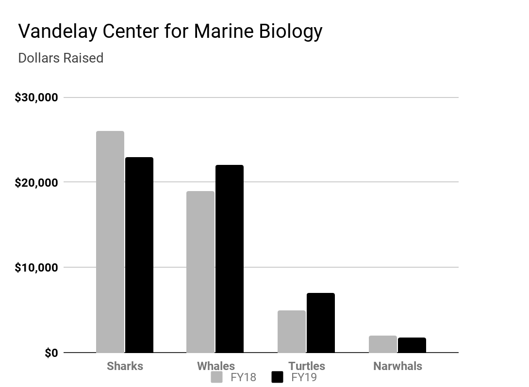
As a reader, you just need to remember one thing that the darker color is the latest fiscal year and the lighter color is the previous fiscal year. You can also compare the subject’s performance easily. You can even delete the legend by adding a caption with other information. Plus, this is printer friendly!
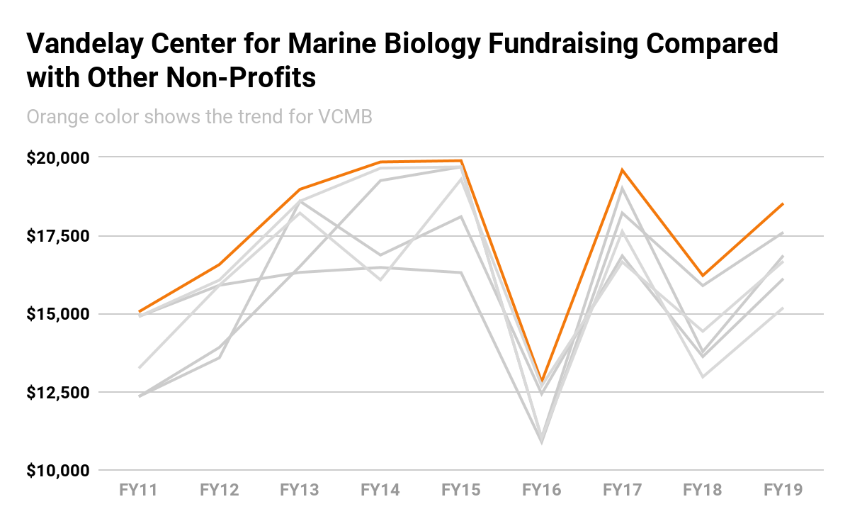
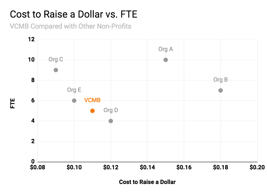
Here’s another example of using color to highlight a data point or trend. When you have multiple data points fighting for our attention, you can highlight one of them to make your point.
If you would like to learn more and improve your data visualization, get more resources here: http://nandeshwar.info/free-data-visualization-tips/

