2 Opportunities for Higher Ed Institutions to Improve their Online Giving Experience

How does the online giving experience to higher ed institutions compare to other types of nonprofits?
That was a fundamental question we sought out to answer in the latest Higher Ed Online Fundraising Scorecard study and the short answer is… not very well.
In fact, when we made $20 donations to 109 higher ed institutions — 51% large universities, 28% small/liberal arts, and 21% community colleges — and captured and scored the experience, we found that 8 out of 10 institutions scored less than 50%. That’s almost 3 times higher than other nonprofits.
Now if you’ve ever made a gift to a higher ed institution that may not be too surprising — they aren’t exactly known for user experience and simplicity in the world of online fundraising — but there were two main areas that stood out and clearly showed how different the higher ed online giving experience is compared to other nonprofits. These two areas are also…
2 Opportunities for Higher Ed Institutions to Improve their Online Giving Experience
-
Reduce Friction In The Giving Experience
As I’m sure you know, friction in physics is a force that resists a movement. Well, the same thing applies to the giving experience.
Friction in the giving experience is anything that slows the donor down, or in some cases, causes them to stop or abandon the process entirely.
In this research study we looked at 5 different types of friction and found that higher eds scored worse or significantly worse in 4 of the 5 (as compared to other nonprofits that we looked at in previous research).
These 4 types of friction include:
- Field number friction
- Confusion friction
- Decision friction
- Steps friction
Let’s quickly run through what each of these looks like for higher ed institutions.
Field Number Friction
The more work that you make a donor do and the more information you ask them to provide, the more likely they are to abandon the process.
And what we found is that higher ed institutions are two times more likely to require non-essential information in their giving process as compared to other nonprofits.
In fact, 58% of higher ed institutions required a phone number (a non-essential piece of information) to complete a gift. But, if you take a look at this experiment, making a cell phone number a required field to process a donation resulted in a 42.6% decrease in conversation rate and ultimately a 50.6% reduction in revenue.
That’s a huge deal.
Ultimately, the more information that you require a donor to give to you adds to the perceived cost of the donation, and if that gets too high you’re risking a lot of potential revenue.
Confusion Friction
Navigation elements, multiple calls-to-action, or insider language can cloud the donor’s mind or worse, lead them away from a donation.
What we found about higher eds is:
- 64% had distracting links
- 43% had multiple calls to action
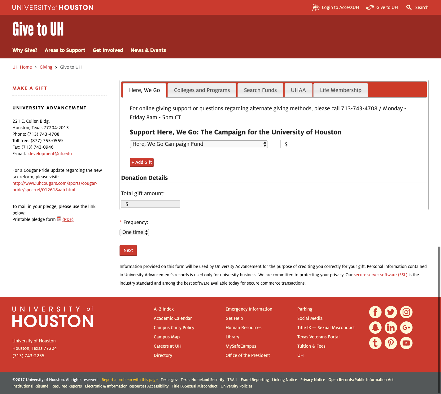
In this example you can see that all of the links on the page take you away from the donation process.

Simply put, these things can distract or confuse donors, and ultimately cause them to abandon the process.
Decision Friction
Decision friction occurs when donors are asked to make too many decisions, choose between equally weighted or among too many options, or make unexpected decisions.
It is easy to avoid this by limiting the amount of decisions a donor must make, or at least by making decisions easier.
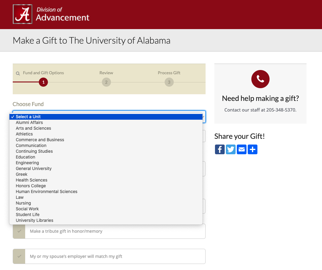
For higher ed organizations we learned that the biggest area of decision friction was in designating donations to different funds.
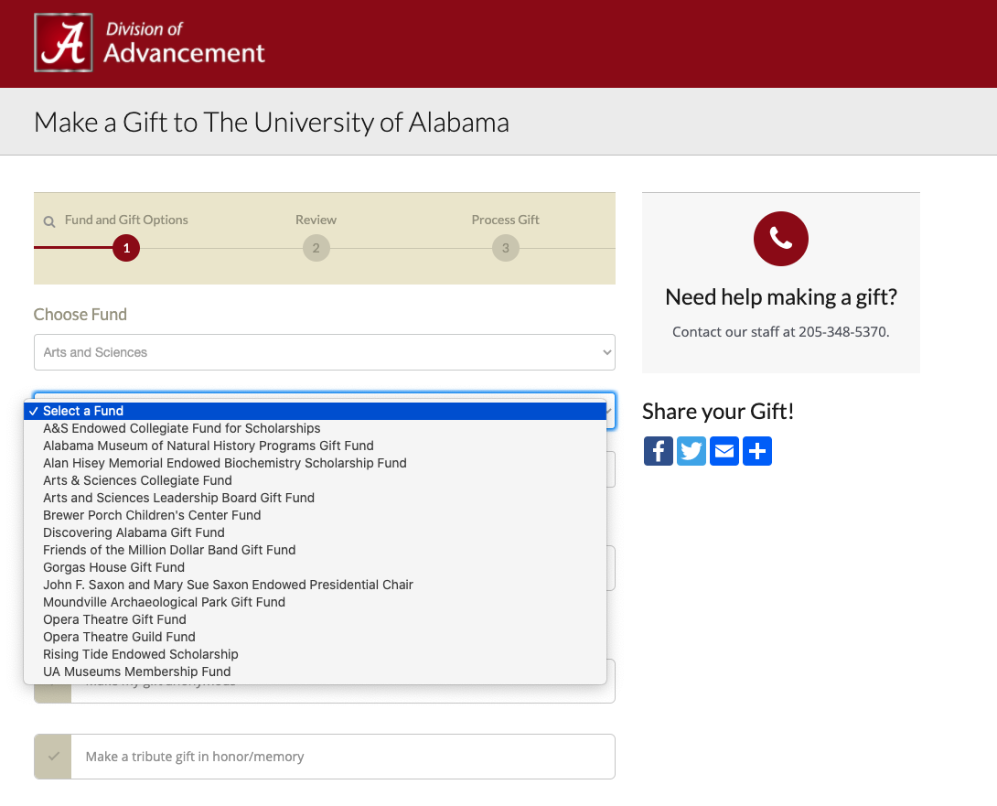
As you can see in this example, there is a drop down with a decent amount of options.

Even more daunting, there were sub-funds to choose from as well.

Even if a donor knows exactly where they want to contribute, this decision is scary.
You may be able to ease this fright, however, by simply pre-selecting an option or setting a default to what is in most need.
Steps Friction
This is the idea that the more steps there are in the giving process — full page loads as opposed to just pure clicks — the chance of abandonment goes up.
What we learned about higher ed institutions is that 77% had three or more steps to complete a donation.
Remember the last example that had the fund drop down and the sub-fund drop down? On top of those steps, they also had a three step giving process that included a verification page.
But, our research has shown that removing these unnecessary steps can increase donations. In this experiment, just by removing the verification page, the organization saw a 176% increase in donations.
This is a prime example of how these friction elements work together to make or break your donor’s giving experience.
Free Blackbaud webinar: donorCentrics® 2019 Annual Report on Higher Education Alumni Giving
-
Use the Thank You Page More Strategically
It goes without saying that the “thank you” page is the end of the donation process; however, it is just the beginning of the engagement process with your donors. At least it should be.
In our research, we found that half of higher ed organizations were not using their “thank you” page in a meaningful way. And even further, 44% of them were not offering any additional call to action.
Talk about a lot of missed opportunity.
It may seem counter-intuitive to ask your donors for something right after they’ve generously donated to your organization, but you’d be surprised by the results you can see.
Here are just a few ideas that some higher ed organizations are already using on their “thank you” pages:
- 26% suggested a social share or connection
- 14% asked to see if an employer would match a gift
- 8% asked for feedback or to complete a survey
- And only 2% asked for gift designation or more information about the gift
Because higher ed institutions are so complex and often have a multitude of funds, this last point – gift designation or more information about the gift – is a huge opportunity.
On top of that, even fewer organizations ask for a second gift or to upgrade to a recurring donation.
So why aren’t more higher eds doing it?
Asking donors to give even more may seem scary. But, as seen in this experiment, just over 5% of people immediately upgraded to a recurring gift and almost 29% of people made an additional one-time gift when asked immediately after their first donation.
Other Key Findings
We saw the higher ed online giving experience diverge significantly from other nonprofits with these two key findings, but there are still a few more I didn’t get to tell you about.
Some other significant divergences we observed included:
- 57% of higher ed organizations used “Give” language as the CTA on their homepage compared to 13% of Other Nonprofits who are more likely to use “Donate” language (78%)
- 62% of higher ed organizations did not have a suggested gift array compared to 17% of Other Nonprofits
- 3% of higher ed organizations used a trust mark (Charity Navigator, Guidestar, testimonial, etc.) on their donation page compared to 41% of Other Nonprofits
Other key findings, like the fact that only 2 out of 10 Higher Ed institutions provided a strong reason to give on their donation page or just 1 in 10 Higher Ed institutions did not provide an option to make a recurring gift, were pretty much in line with other nonprofits in past studies looking at the same questions.
Get The Study
You can get all 7 key findings, 2 infographics, and see examples and experiments by downloading the study, for free, at higheredonlinefundraising.com
