Website Design for NGOs: 5 Essential Strategies

As the leader of a non-government organization (NGO), you know how important it is to leverage your online presence in order to publicize your mission, draw in donations, and connect with your supporters. You likely also know that one of the best tools you have for accomplishing these objectives is your website.
But your website won’t get your organization very far if it’s poorly designed. Even if you’re consistently posting excellent content on your website, you still need to think through its user experience and focus on its look and functionality. Optimizing your site’s design will give your organization the best chance of engaging supporters online.
One common misconception people often have is that you need a big budget and a coding expert to create a beautiful and useful NGO website, but that’s not the case. All you need is an easy-to-use website builder, or content management system (CMS), and an understanding of a few web design strategies. In this post, we’ll walk you through the following strategies to jumpstart your design journey:
- Leverage your NGO’s branding.
- Optimize for accessibility.
- Focus on your donation page.
- Create event landing pages.
- Integrate with social media.
As you read through these strategies, keep your supporters in mind. You’ll need to view your website from their perspective and anticipate what they need and want from your organization. Ask yourself, “What resources do I need to provide to help my supporters engage with my cause?” and “How can I design my website so visitors want to return to it again?” Keeping your supporters top of mind will help you create a website that gets real results.
Let’s get started with our first strategy.
1. Leverage your NGO’s branding.
Your organization’s brand shapes the world’s perception of your organization, and, by default, your mission. This means how you present your organization on your website can go a long way in encouraging supporters to get involved with your cause.
The first thing you’ll need to do in order to leverage your organization’s branding to this end is to develop a style guide. Then you can use your CMS to customize your website according to that style guide. Here are some elements you should include in your style guide:
- Mission and overall goals: All of your branding should point your supporters back to your overall mission and larger goals, so taking the time to include these in your style guide should help focus your site branding.
- Audience: Think through who you picture visiting your site (you might even have some site data to inform your thinking). You can even create a supporter persona, a semi-fictional person made up of your supporters’ characteristics, to help you brand with your users in mind.
- Tone and language for web content: Do you want your NGO to come across as fun-loving and laid back? Serious and professional? Whatever your mission is, you likely have an idea of what you want your organizations to “sound like” on the web. Nail this down in your style guide so all of your content can be consistent. You can also include words, phrases, or terms you want to avoid or leverage in your content.
- Colors, fonts, logos, and imagery: These visual branding elements help you create a website that looks like it was created exclusively for your NGO. When planning out your visual branding, think about what you want your website visitors to feel when they first see your site.

Once you have a style guide, make sure your team has it handy when creating content or updating design elements on your website. Your style guide will help your website appear consistent with the rest of your operations, which in turn will make your NGO look more organized and professional, boosting your reputation with your supporters.
2. Optimize for accessibility.
Is your website optimized for users of all abilities? If it isn’t, you could be missing out on opportunities to engage a larger swath of your audience. To avoid this, you should optimize for accessibility. Here are some things you can do to make your website more accessible to everyone:
- Review the Web Content Accessibility Guidelines. The WCAG specifically suggest web designers aim for a high contrast ratio on all images and graphics, use easy-to-read fonts, include closed captions and transcripts on multimedia elements, and provide alt-text for all images.
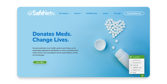
- Use your CMS to include an accessibility widget. An accessibility widget can empower your website visitors to change your website to suit their needs by switching the color scheme to greyscale, increasing font size, and highlighting links.

Some organizations shy away from accessibility optimization because they feel it’s too time consuming. Courts are increasingly considering websites as “public accommodations” that fall under the Americans with Disabilities Act. If you’re ever charged with violating the ADA, having an inaccessible website can become a legal liability. Plus, all you’re doing by not providing an accessible website is shutting out people who care about your cause. Take the time to make your website accessible and you’ll be able to engage more supporters!
3. Focus on your donation page.
Your online donation page deserves a great deal of attention when you’re working on the design of your website.
In fact, if you’re short on time or resources, put your efforts into the donation page first— after all, this is where your supporters give to your cause, empowering you to move forward with your mission.
Here are some of Morweb’s tips for donation page design:
- Make sure your donation page is mobile-friendly. More and more donors are using their phones to give, and you need to be ready for them. You can make the process of ensuring your page is “thumb-friendly” simple by using a CMS that automatically optimizes for mobile.
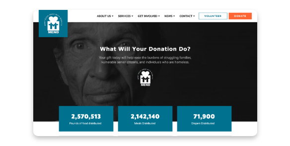
- Brand your donation page. Too often NGOs let their donors use a donation page that isn’t branded to the organization. This can leave donors feeling like your page is untrustworthy (even if it isn’t) and like the giving experience is disconnected from your mission. Try including your logo and brand colors on the page to make the transition to your donation page from your other pages feel seamless.
- Include multiple giving options. Offering lots of ways to donate doesn’t just mean you should take both credit and debit card payments, though you should. You should also give donors the opportunity to opt into your monthly giving program or provide a matching gifts database they can search to find out if their employer participates in donation matching.

As you’re designing your donation page and form, don’t forget to also plan in a way to show donor appreciation. You might, for example, use your CMS to create a confirmation page that pops up after a donor gives. The confirmation page can help you thank them for their donation and tell them how you’re going to use it to further your cause, increasing the likelihood that your donor will use your donation page to give again.
4. Create event landing pages.
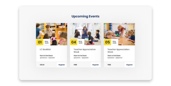
One of the best things you can do with your website is to establish it as a place where your supporters can get up-to-date information about your operations, and especially your events. To really get your events to stand out on your site, try using your CMS to create an event landing page with the following features:
- Clear information about the event format (hybrid, virtual, or in-person), pricing, capacity, sponsors, and entertainment
- An easy-to-use registration form that encourages further engagement with your organization
- Social media buttons that allow your supporters to share and promote your event on social media (especially if your event is a peer-to-peer campaign)

Event landing pages allow you to keep your event information from clogging up your main pages and help you provide a one-stop resource for people specifically interested in your event. Don’t forget to utilize your style guide when creating an event landing page!
5. Integrate with social media.
Whether it’s your volunteer registration page or an information blog post about donation matching, make sure your website’s content is ready to be shared on social media. Also be sure your website visitors know you have social media profiles they can follow on their favorite platforms.
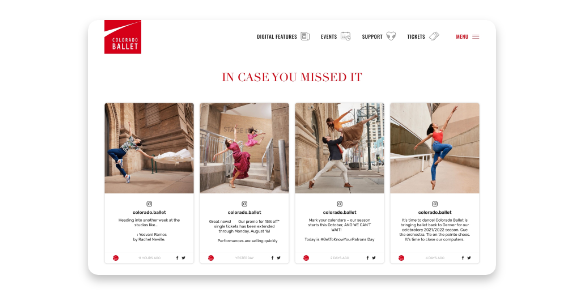
With an NGO-specific CMS, you’ll be able to add social media icons and embed live feeds on your web pages. Adding these features will encourage continuous movement of traffic between your social media and your website.

There’s no need for your NGO to settle for a sub-par website, especially when you have a CMS that comes equipped with your needs in mind. As you use these strategies to make the most out of your CMS and design a fantastic website, remember to focus on user experience. A beautiful and easy-to-use website will help you engage your supporters far into the future. Good luck!
