The Best of End-of-Year Email Campaigns

For this month’s Designing for Good, it’s time we showed more love to all of you tireless nonprofit email marketers out there.
In this episode, we decided to partner with venerable data evangelist Steve MacLaughlin, who does a famous yearly break down of almost 500 end-of-year end-of-year email appeals.
With the giving season almost upon us, we’ve mined Steve’s email goldmine and other corners of the web to find our favorite EOY email design inspirations. We’re highlighting the best of last December’s appeals and some of our favorite fundraising emails from 2016 to help kick off your end-of-year email campaigns.
How did we decide which emails were the best? We judged our favorites using criteria from John Haydon:
- The hook: Does the email grab our attention?
- The hold: How successfully does the email keep our attention?
- The call-to-action: How strong is the final call to engage, volunteer, or donate?
Want step-by-step help for designing your own EOY campaign? Download the eBook!
And after you’re done, you should check out Really Good Emails for another treasure trove of email marketing gems. Stay inspired, designers for good!
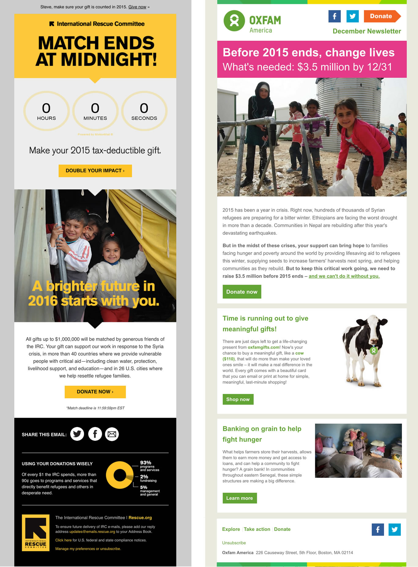
Above: International Rescue Committee creates real urgency with “Match ends at midnight” masthead, dynamic timer, and perfect imagery. We also love the snapshot in footer of how each donation dollar is used. Oxfam uses wonderfully bright, punchy colors throughout with a prominent yet not shouty marquee plea for immediate action.
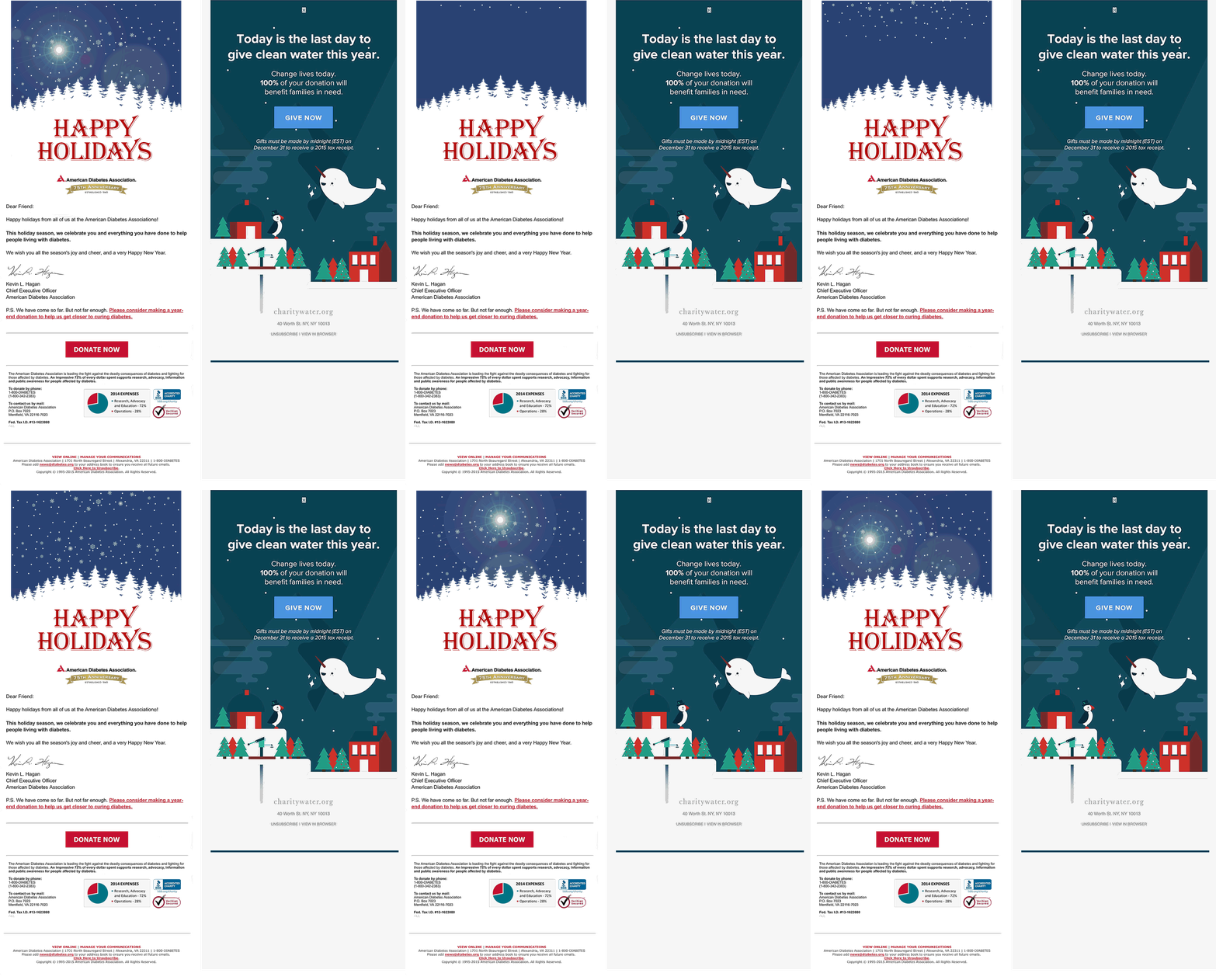
Below: Two whimsical holiday appeals from American Diabetes Association and charity: water. ADA’s breakdown of each donation dollar in footer lends a nice layer of trust to their overall appeal.
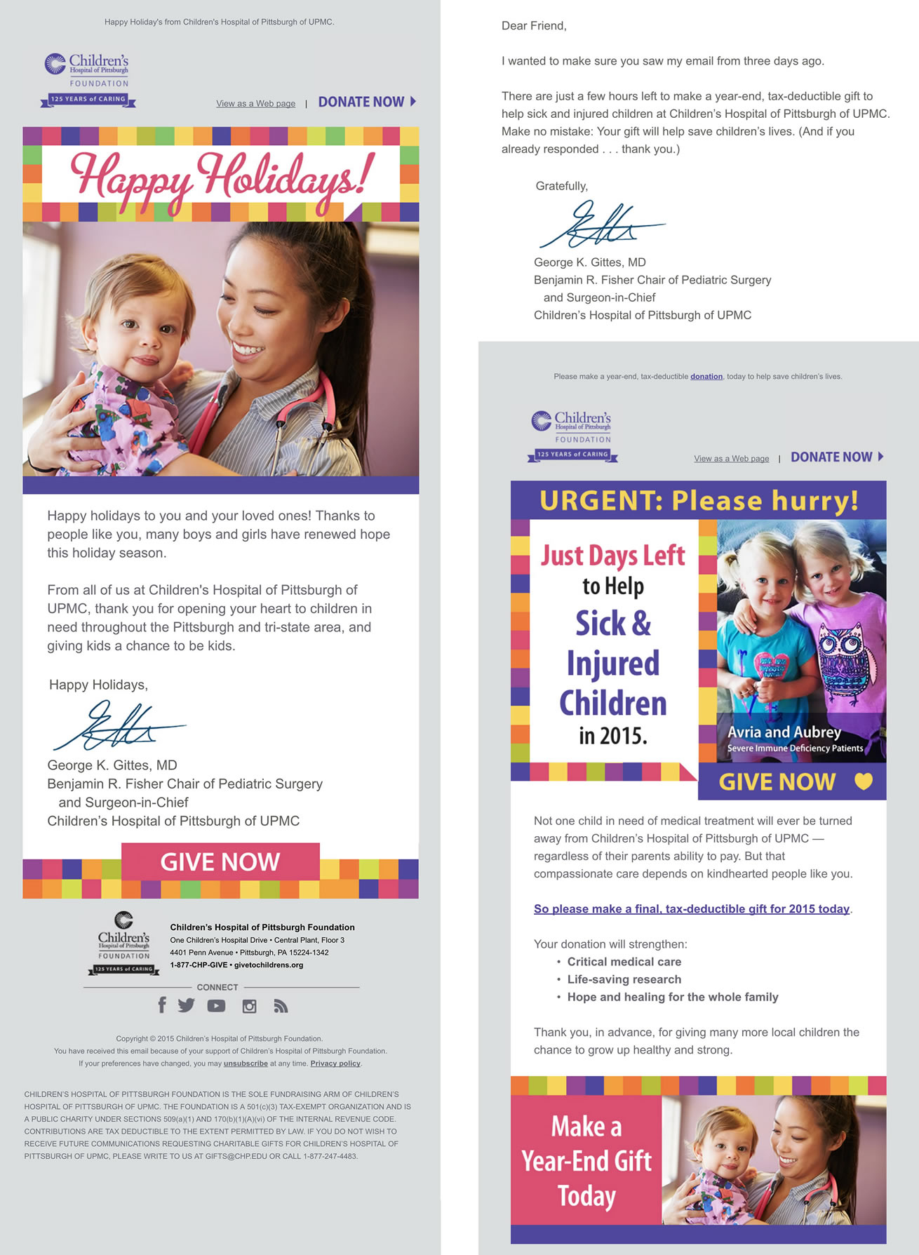
Children’s Hospital of Pittsburgh employs smart, colorful branding to create a continuity from first touch of season to the last-minute follow-up appeal.
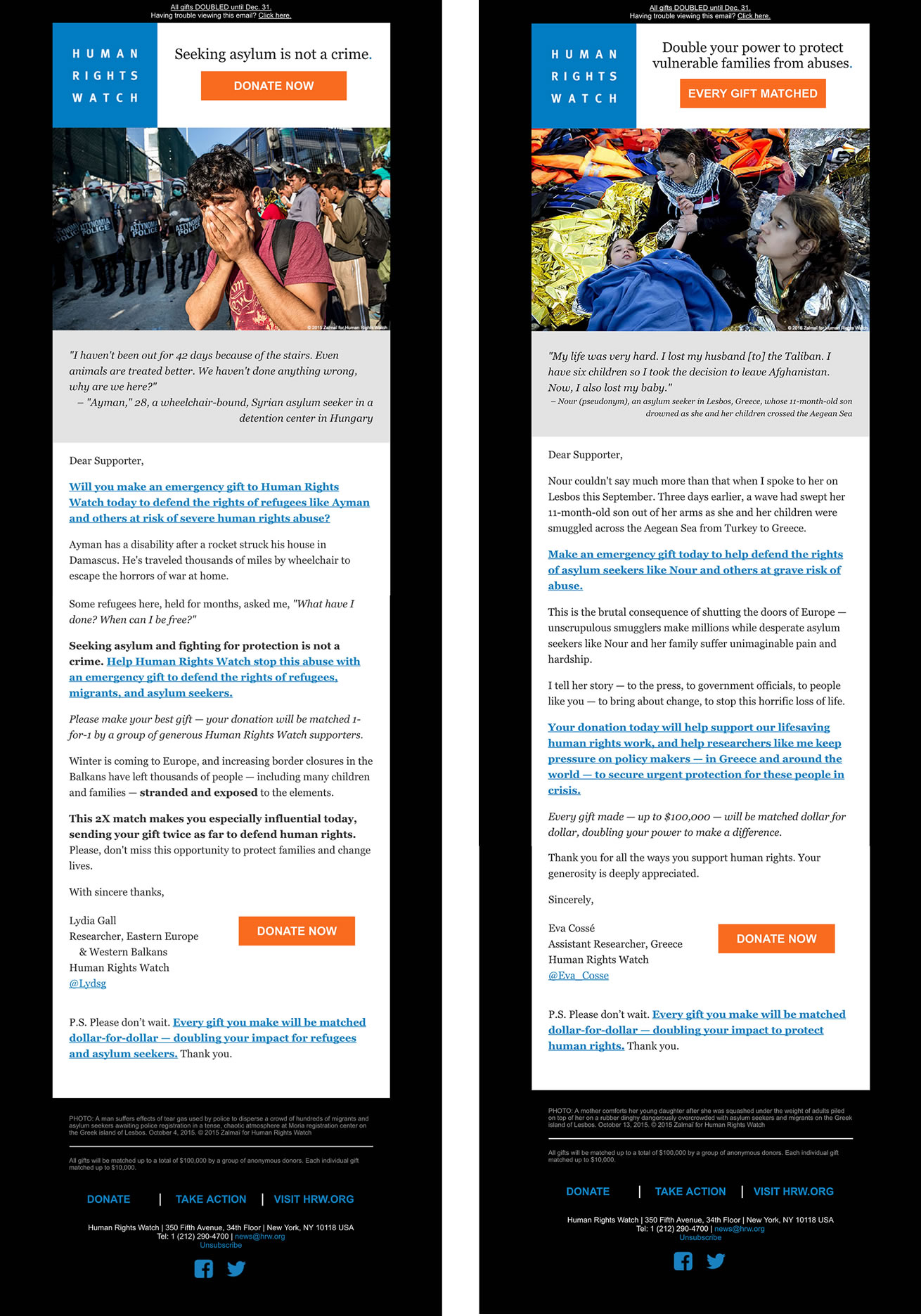
The images from Human Rights Watch cannot be ignored. Each appeal combines compelling refugee testimonies with clear donation options on headers and footers.
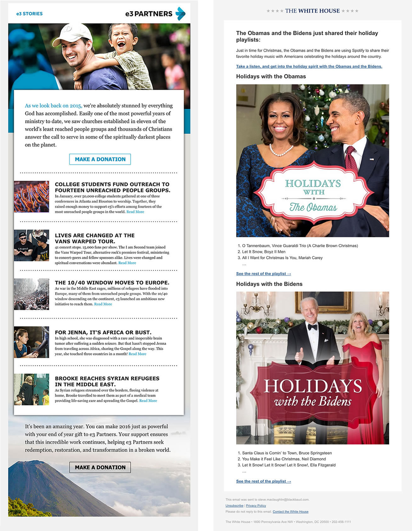
e3 combines an appeal with clear stories of organization impact from throughout 2016. From The White House, who doesn’t like a free Christmas gift from the Obamas? A playlist costs your organization nothing but a little creativity. Genius.
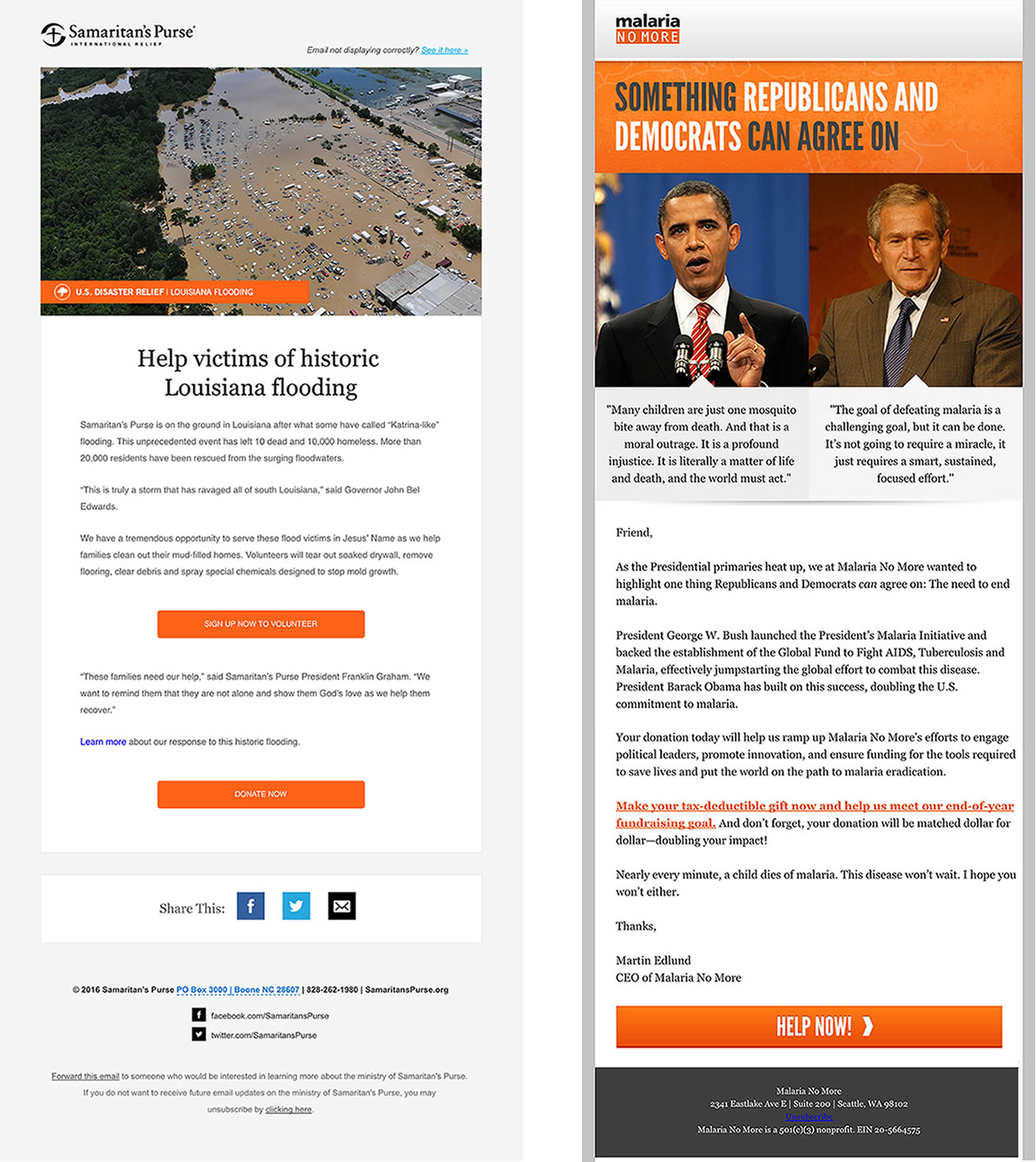
Samaritan’s Purse design is so simple and classic. Visual alone speaks volumes and the two call-to-action buttons are perfect. Malaria No More grabs attention with a novel apolitical plea in middle of the holiday season.
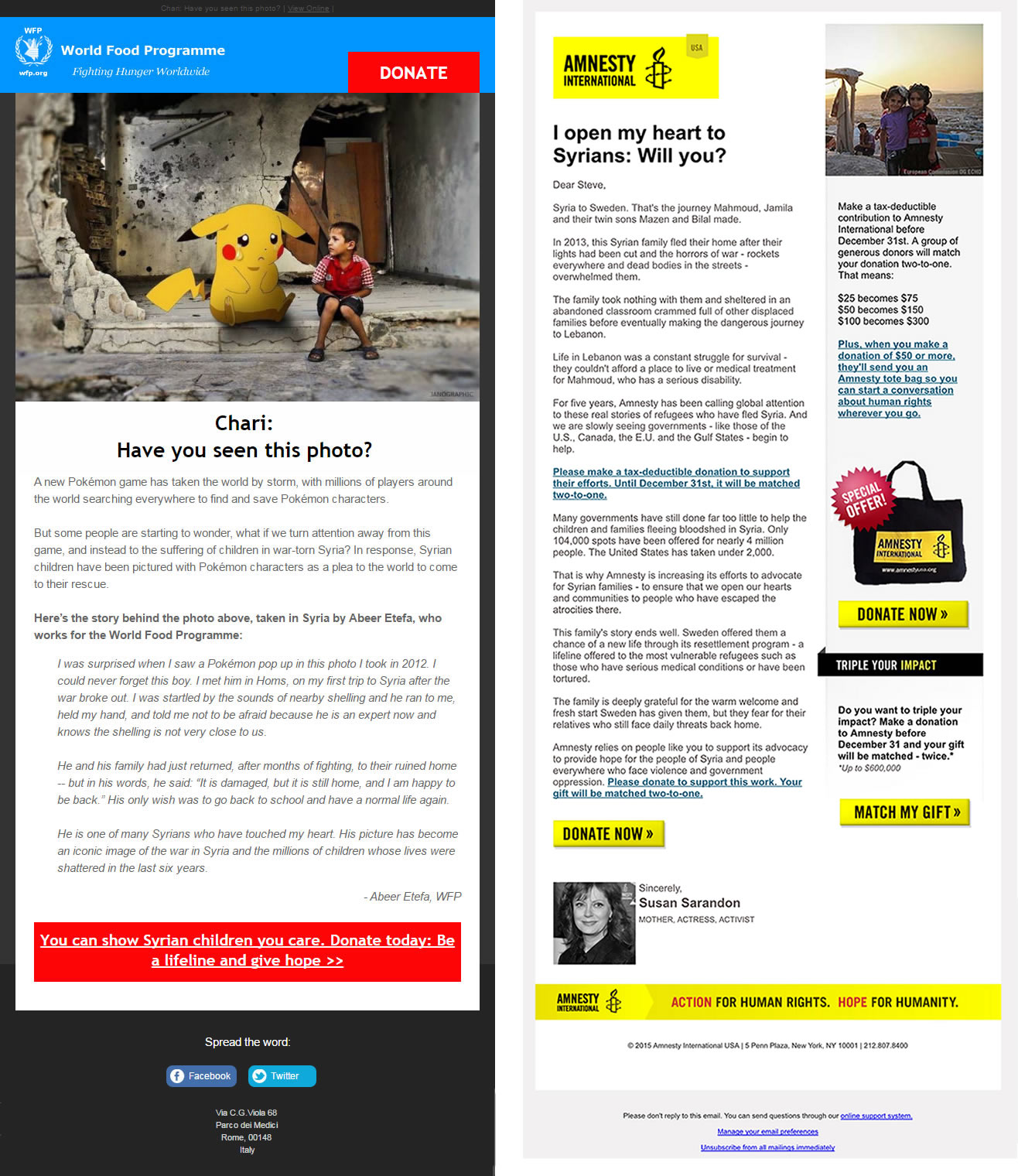
World Food Programme uses a poignant visual to great effect. From Amnesty International, who doesn’t want to get an email from Susan Sarandon?
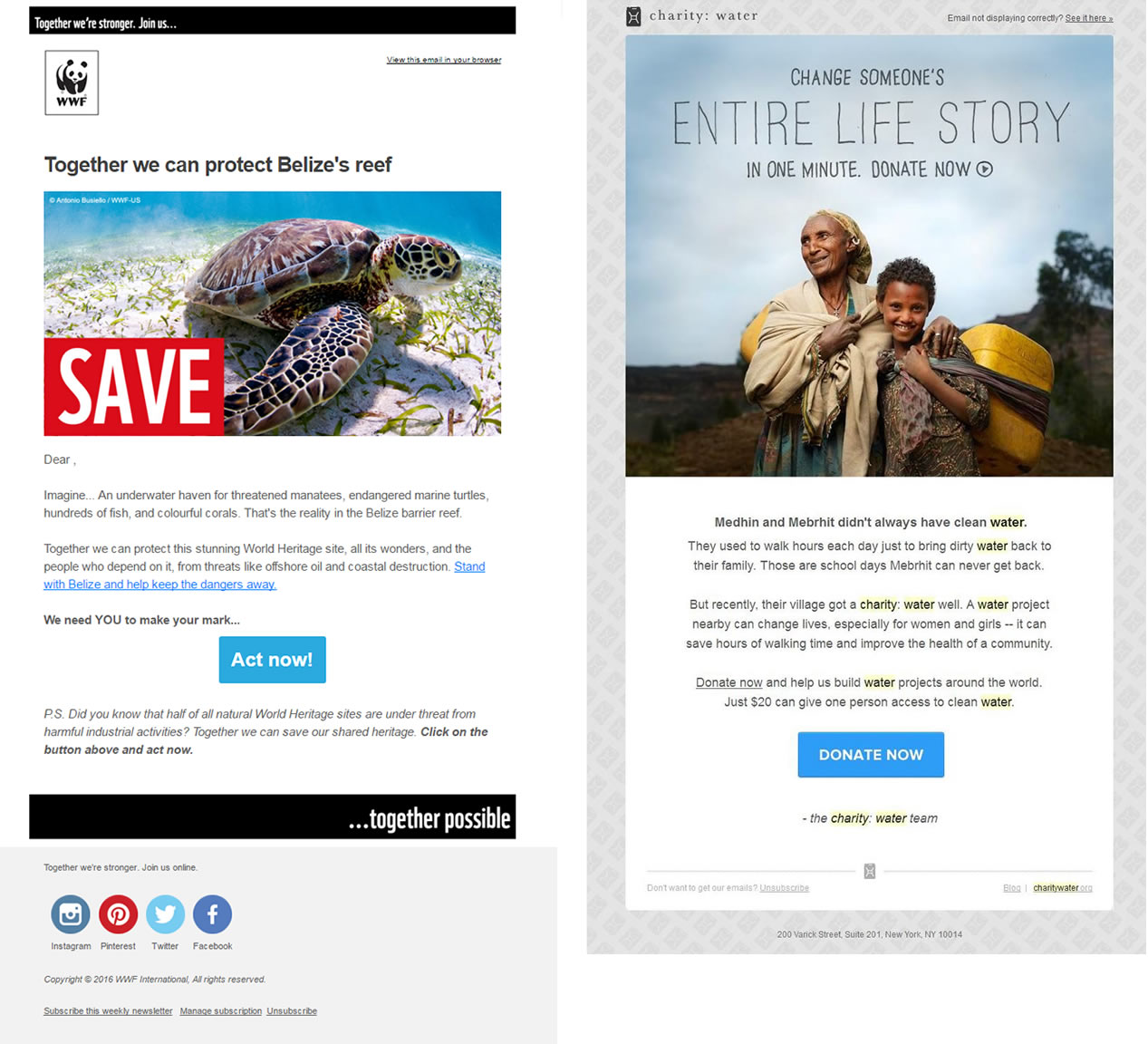
WWF never runs out of great imagery while another appeal from charity: water is simply lovely from start-to-finish.
If you’ve seen great nonprofit design inspirations out there that should be highlighted, please comment below or send my way at @bkgranger!
End-of-Year Fundraising Toolkit
Raise more with strategies and
best practices for year-end giving.
