Donation Form A/B Test: Single-Page or Multi-Page?

When nonprofit customers ask us what donation form designs are most successful, we always recommend testing. While one form design may work best for one nonprofit, your audience is unique and may respond better to a different design.
Caveats aside, it’s always helpful to have evidence of donation form performance and that’s what I’m sharing today. We recently designed and tested two new donation forms for Fidelco Guide Dogs. Both forms use a big background image of a beautiful Fidelco German Shepherd. We’ve found through our work with many nonprofits that forms with large bold imagery tend to perform better than forms with small images or no images.
Baseline Form Design – Multi-Page Form
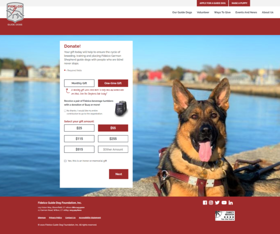
The original donation form we designed for Fidelco was a multi-page form where the donor progresses through a few steps to complete their donation. These forms are nice visually because they allow for a simpler look when the form first loads. We relied on progressive disclosure for this form so that the additional options were only revealed if the donor requests them. Here’s how the flow worked:
- On screen 1 the donor decides the donation frequency (monthly or one-time), amount and has the option to add honor or memorial options which includes eCards.
- On screen 2, the donor enters their contact information.
- On screen 3, the donor enters their credit card information and submits payment.
Multi-page form screenshot

Alternate Form Design – Single-Page Form
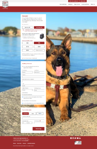
As we started building the form, we decided to build another version where all steps were displayed on a single page. Sometimes these forms perform better because they establish proper expectations for donors right away by showing all steps.
Single-page form screenshot

The Test
We used Google Optimize to run the A/B test to compare the single-page form with the multi-page form. This is a free program that will split traffic between two forms and then report back on which version had more conversions. In addition to the Google Optimize data, we evaluated the number of donations, total amount of donations and average donation for both forms during the time the test was running.
My hypothesis was that there would be no major difference between the two forms. I was DEAD WRONG!
The Results (drumroll please…)
The multi-page form won on all fronts:
- 33% more total conversions
- 75% higher conversion rate (conversions per visit)
- 90% more overall donations
- 54% higher average donation
While presenting these findings to Fidelco, they hypothesized that the multi-page form won because it’s a better experience for mobile donors. Perhaps the shorter pages make the form completion process seem less daunting and thus, more enjoyable. To validate this, I restricted the data to mobile-only donors and the winningness of the multi-screen form was even more magnified, proving their hypothesis was correct.
I think it’s safe to say that today, I recommend multi-page forms over single-page forms. Which type of form do you have on your site? Maybe it’s time to test out a new design!
