Inspire Generosity with a Better Online Donation Form

In digital philanthropy, it has never been more important to seek out and embrace innovations, especially innovations in online donation forms. Your online giving form is the primary instrument you use to process a donation, and it’s also the key tool you use for collecting valuable information about your donors. You’re expecting a lot from your donation form.
On the giving side, donors also are expecting a lot from your donation form. They demand the online giving experience to be nearly instantaneous, easy, secure, personalized, mobile-friendly, and reflective of your brand and mission. If your nonprofit organization is eager to harness the full potential of your digital fundraising efforts and give your donors what they expect, it’s good to have a guide. Here, we’re offering a roadmap to help you inspire generosity with a better online donation form.
The Dawn of Digital Philanthropy
Online donations emerged as a fundraising force in the mid-1990s, marking a pivotal shift in how nonprofits engage with donors. Trailblazers like WWF, Greenpeace, and Amnesty International achieved remarkable milestones and established our foundational understanding of how to craft an effective online donation form.
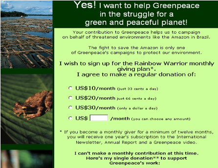
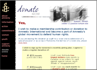
Their “secret sauce” for successful online giving? It’s in the nuanced application of behavioral science, based in part on Daniel Kahneman’s Theory “Thinking Fast and Slow.” This theory explains that our brains are designed to think in two ways: System 1, which is instinctual, and System 2, which is rational.
The Two Systems of Thinking
Can you see how these two systems of thinking could have influenced the design of the donation forms from Greenpeace and Amnesty International?
System 1: Fast
- Subconscious
- Effortless
- Prone to errors
- Most information is processed by System 1
System 2: Slow
- Deliberate
- More effortful
- More accurate
- Only relevant information is processed by System 2
Behavioral Science: The Heart of Donor Engagement
Understanding the psychological underpinnings of donor behavior has emerged as a central theme in designing donation forms that resonate. Simplicity, clarity, and the strategic use of imagery and color psychology elicit emotional responses and guide donors smoothly through the giving process. By marrying design principles with insights from behavioral science, nonprofits can create more engaging and efficient donation platforms that enhance the donor experience and boost conversion rates. Sometimes, one clever tweak is all it takes for dramatic results:
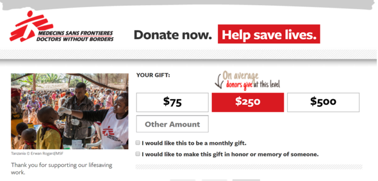
- Medecins Sans Frontieres (Doctors without Borders) had a 34% higher number of $250 gifts by setting the default option at $250 on the donation form. This also led to a 25% higher average gift amount.
Embracing Modernity: The Path to Frictionless Giving
How can contemporary strategies and technological advancements redefine the donor experience for your organization? Blackbaud’s introduction of a new optimized Online Giving donation form represents a leap forward, offering a donor-centric approach that prioritizes ease of use, mobile responsiveness, and trust-building elements.
Data from early adopters illustrates the tangible benefits of a seamless checkout process. For Washington’s National Park Fund, the optimized Online Giving form from Blackbaud compliments and reinforces the language, look, and feel of their website, improving a donor’s experience as they scroll.
“For us, the real benefit is having a donation form that pops up and is visible over an existing web page on our website as an alternative to the stand-alone standard form,” said Alex Day, director of marketing, communications, and database for the Fund. “We want people to be landing on a page that feels like our platform, our website, even our domain, and that’s exactly what this form does. Blackbaud’s donation form gives us the brand credibility we want.”
As the organization raising private funds for Washington state’s picture-perfect national parks— Mount Rainier, North Cascades, and Olympic—the Fund relies on highly visual communications. Think snow-capped peaks and meadows in bloom. They do not want their donation forms to compete with this powerful imagery.
“The optimized forms reduce the steps needed to create a really cohesive, brand-compliant, consistent, and compelling campaign donation page,” Day said.
The results for the Fund’s optimized forms have been outstanding:
- 18% increase in donor conversion based on first interactions
- 40% more donations
For more examples of advancements in online donation forms, register for the free, on-demand webinar series, Creating a Frictionless Online Donation Form. You’ll get a firsthand look at how innovative forms are implemented in real-world scenarios.
Beyond the Donation: Sustaining Engagement
After the initial donation, it’s critical (but not easy) to maintain donor interest. As in the other stages of the donor journey, behavioral psychology can be effective when applied to stewardship. Fundraisers who understand the power of their online content, including donation forms, take into consideration the concept of hedonic adaptation. It’s a phenomenon in which humans become insensitive to novelty, so you have to keep upping the ante to get a response.
For development teams, this means creating varied and engaging content to keep donors invested in the cause. Strategies for post-donation engagement should focus on preventing donors from becoming desensitized to repetitive messaging.
SOS Children’s Villages Canada redesigned the post-donation journey to include more variety and surprise, which has led to the following results:
- 63% renewal rate on 6,000 newly acquired monthly donors
- 3% renewal improvement over industry average
- Approximate donor lifetime value (LTV) increase of $216,000 over five years
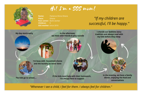
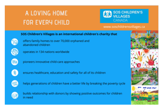
Here are three new diverse communications SOS Children’s Villages Canada added to its 12-month post-donation stewardship program to keep supporters interested and engaged.
1. Welcome series
Direct mail and email/video reinforce donor impact with messaging that appeals to both fast and slow systems of thinking.
Month 6
Donors are invited to try out a fun, interactive online quiz.
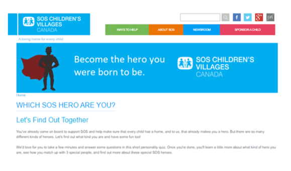
Month 11
Supporters receive a charming token of thanks: brand-appropriate artwork to color and display, maybe on a donor’s fridge or in their office.
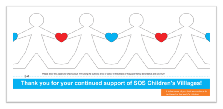
A Call to Innovation
Nonprofit organizations have the same mandate to evolve as any commercial operation: It’s imperative to embrace innovation and continuously improve the online experience. For nonprofits, this is especially true of their online donation forms.
By understanding the historical context, applying behavioral science, and implementing cutting-edge solutions, nonprofits can not only meet but also exceed donor expectations. The future of online giving is bright, and by leveraging these strategies, organizations can enhance their fundraising efforts, forge lasting donor relationships, and drive better outcomes for their causes.
Want to know more? Deepen your learning with the Donation Form Workbook, a comprehensive guide to enhance your donation form strategy.
