Create a More Effective Nonprofit Website Using These 2 Simple Suggestions

Effective nonprofit websites don’t exist as boutiques to show off information. But you already know that.
You know that your nonprofits website is a tool that should be used.
Used to engage, interact with and mobilize your audience – A tool that should ultimately inspire action.
From our extensive research and work with nonprofits in creating strategic, impactful websites, we’ve uncovered and organized a list of the top 10 elements of an effective nonprofit website.
Here are two of the ten key elements every nonprofit website should have. To get all ten make sure to check back in with us over the next week or join us for a live discussion on this topic during our Free Guide Series!
Best Practice #1: Know Your Audience

Without knowing who your website is serving you’re shooting in the dark. No matter how hard you try, it will be nearly impossible to create an effective nonprofit website – one that meets the needs of your constituents and helps you achieve your mission.
- Focus on their needs – who are your key groups and what do they care about? How do they interact with your site? By understanding the #1 Reason Nonprofit Websites Fail and How to Fix It Immediately you’ll be well on your way to creating an excellent nonprofit website.
- Use the right language – know that writing is an art…AND a science. Every bit of content should showcase your mission. Avoid industry jargon and acronyms. Keep it simple, but include descriptors for clarity and SEO improvement.
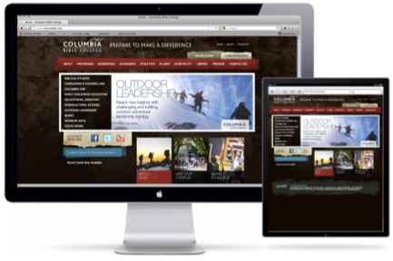
- Keep mobile in mind! In 3 years mobile will be the #1 method your audience accesses your site. Are you ready?
Best Practice #2: Focus Your Homepage

“The Web is a World of First Impressions…Users form an opinion of a website within the first few seconds of loading It.” –Jason Gross, “The Role of Design in the Kingdome of Content” www.smashingmagazine
To create an effective nonprofit website you’ve got to focus on your homepage.
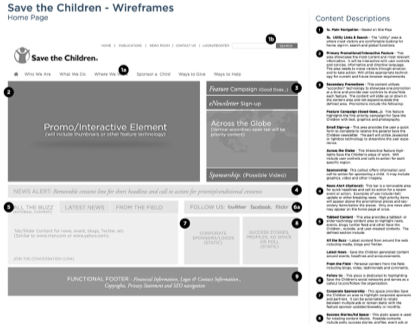
- Prioritize content – Wireframes are a key step in creating visual hierarchy. What content elements are most important and deserve prime real estate? Remember YOUR goals as well as your AUDIENCE’S during this exercise, and stay strong – not everything everyone wants fits, or even belongs, on the homepage.
- Make sure it’s scannable – Use of headers, content blocs and visual design will allow for users eyes to follow the right path of content.
- Provide choices – not everyone accesses your site in the same way; make sure you provide different ways to access information to accommodate.
- Test – Show your homepage to audience members, and then ask them a series of mission and organizational questions. If they cant’ answer them, consider refocusing and prioritizing your homepage.
Learn more about best practices in nonprofit web design during our free Guide webinar Series the week of April 23rd. Register now!
