15 Techniques Used by Top Nonprofits to Boost Donor Acquisition and Online Fundraising Results

Online fundraising isn’t a fad.
As a matter of fact, online fundraising accounted for seven-percent of total fundraising in 2016. Online fundraising has also proven to be an extremely effective donors acquisition vehicle. The surge in online giving to the ACLU—6x their yearly donations raised in one weekend—shows us the potential that exists with online giving.
These are facts that can’t be ignored.
Whether you’re using powerful online fundraising and marketing software or keeping it simple, it’s imperative that you take online fundraising seriously.
Learn about trends and best practices in fundraising in the Blackbaud Institute’s 2021 Charitable Giving Report: Download now to get the information you need to help boost your organization’s fundraising performance.
Let’s take a look at some online fundraising ideas—the fifteen most effective donor acquisition and online fundraising techniques used by top nonprofits.
1) Go Mobile, Now!
Does your church have a mobile fundraising strategy? How about your nonprofit, school, or charity? In 2016, 17% of online transactions were made using a mobile device. This was a 21% year-over-year increase and represents a continuing shift by donors to consumer-oriented engagement channels.
If you’re using a website analytics tool like Google Analytics, jump in there to see how much of your web traffic is coming from mobile users.
Here’s a quick video to show you how.
Next, narrow your analysis down to your donation form to see how many people are visiting that specific page from a mobile device. Make sure to set the date range back a year or two, so that you can look at the trend over time. You’ll likely find that mobile traffic to one of the most important pages on your website has grown significantly.
2) Grab People’s Attention
You probably spend a lot of time driving people to your website, but visits don’t equal dollars!
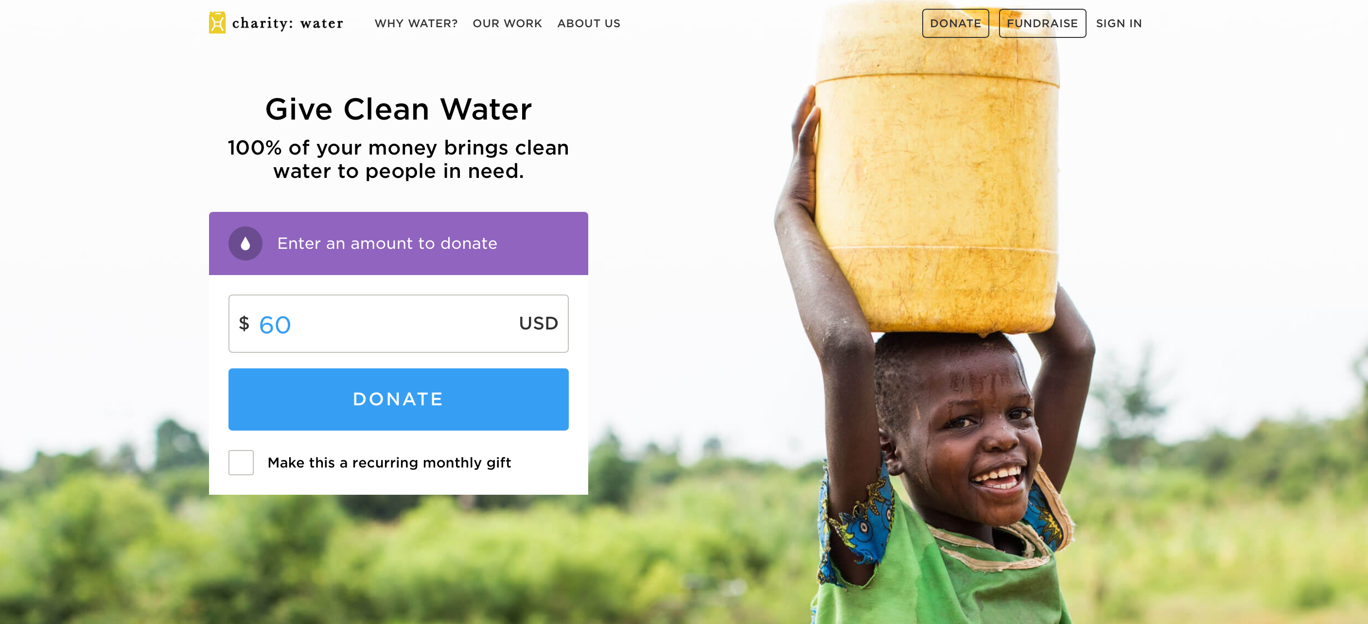
Once you have people on your website, it’s important that you draw their attention to your “donate now” button. Take charity: water for example. When you land on their home page, you fairly quickly notice the big, blue button that says, “donate now”.
There are a few things that charity:water does really well here:
- charity: water wasn’t afraid to make their fundraising ask the most important element on the page.
- They let you know exactly how your donation will be used—100% of your money brings clean water to people in need.
- They’ve used strong imagery that supports their reason for giving.
- The color of their call to action stands out on the page. And they didn’t have to use a bright read button that glows in the dark.
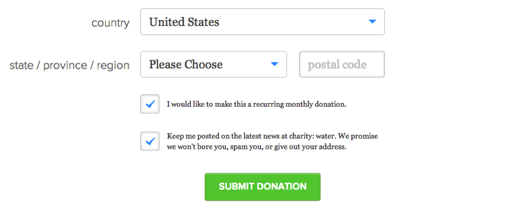
- They give you the option to make your donation a recurring gift.
Expert Tip: Give your “donate now” button the recognition it deserves, but do it with the right supporting elements. 3) Make Sure it’s Branded
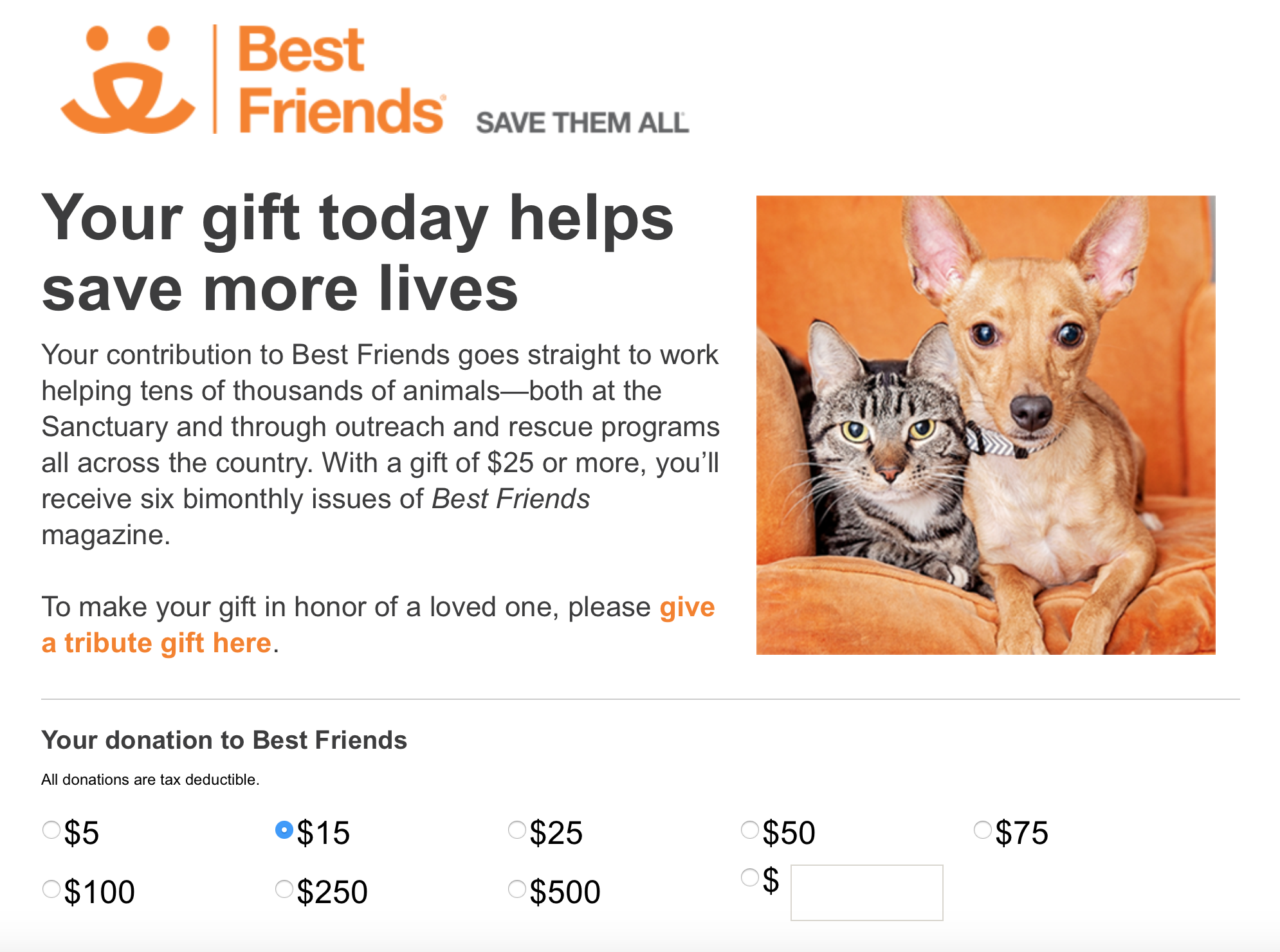
Building your brand is tough. It takes hard work, strategic thinking, time and persistence- and not to mention, money. Which leads me to wonder … Why leave your donation page lightly branded or, even worse, completely unbranded? Take a look at Best Friends Animal Society , who has ensured their donation form is fully branded. They have their name, logo, compelling imagery, typography, and copy that align with their brand standards. Doing this helps potential donors feel secure and understand that they are in the right place. A branded page builds trust, confidence and increases the likely hood that a person visiting your donation form will complete their transaction. Expert Tip: Brand your donation form like @BFAS so donors know it’s you! 4) Use Compelling Imagery
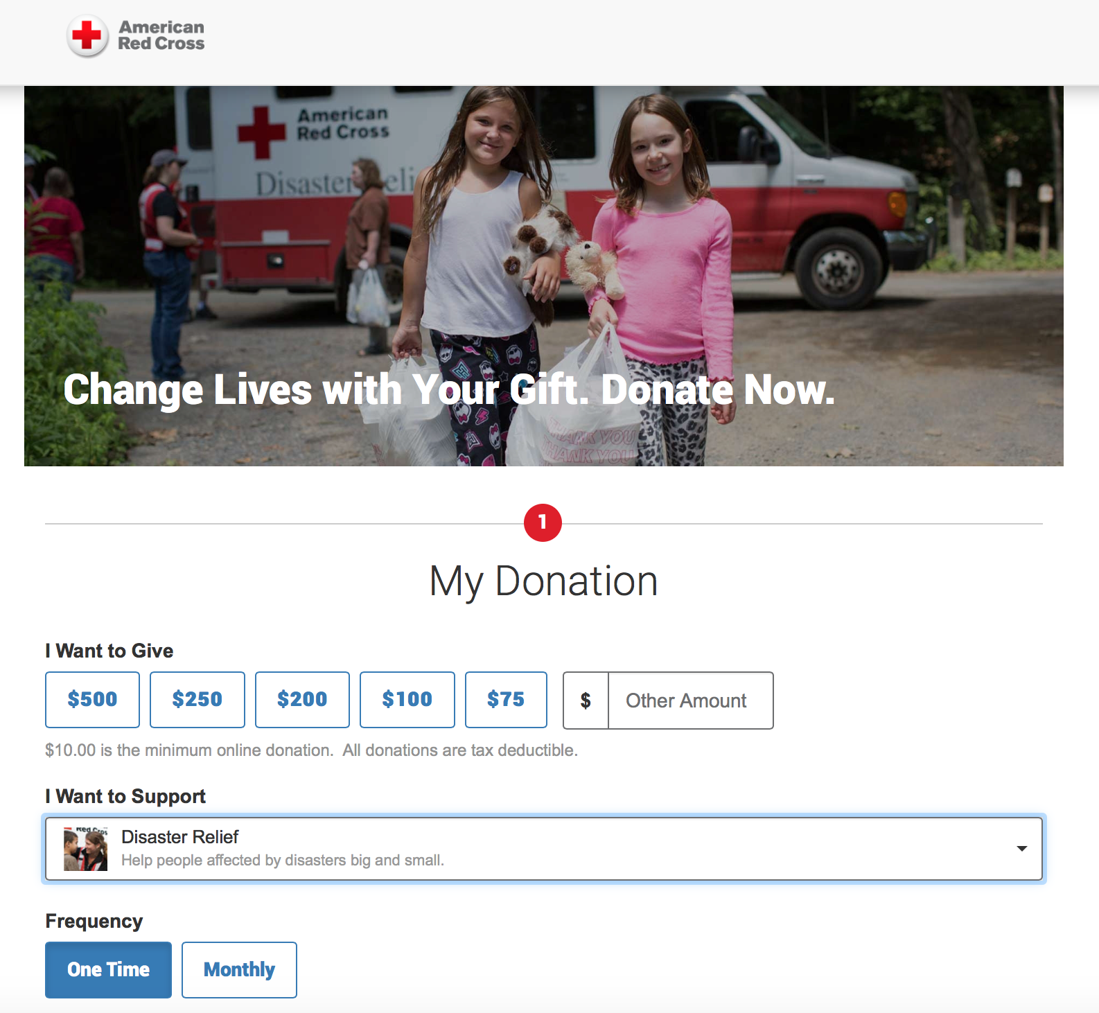
People are visual beings. We like to “see” what we buy. That’s why online stores use lots of product images and why brick and mortor stores will never die. Have a look at how The Red Cross does it. They keep things simple, all while doing a great job of helping people “see” the value and impact of their donation, something every nonprofit should do. Expert Tip: Use compelling imagery on your donation form like @RedCross! 5) Simplify, Simplify, Simplify
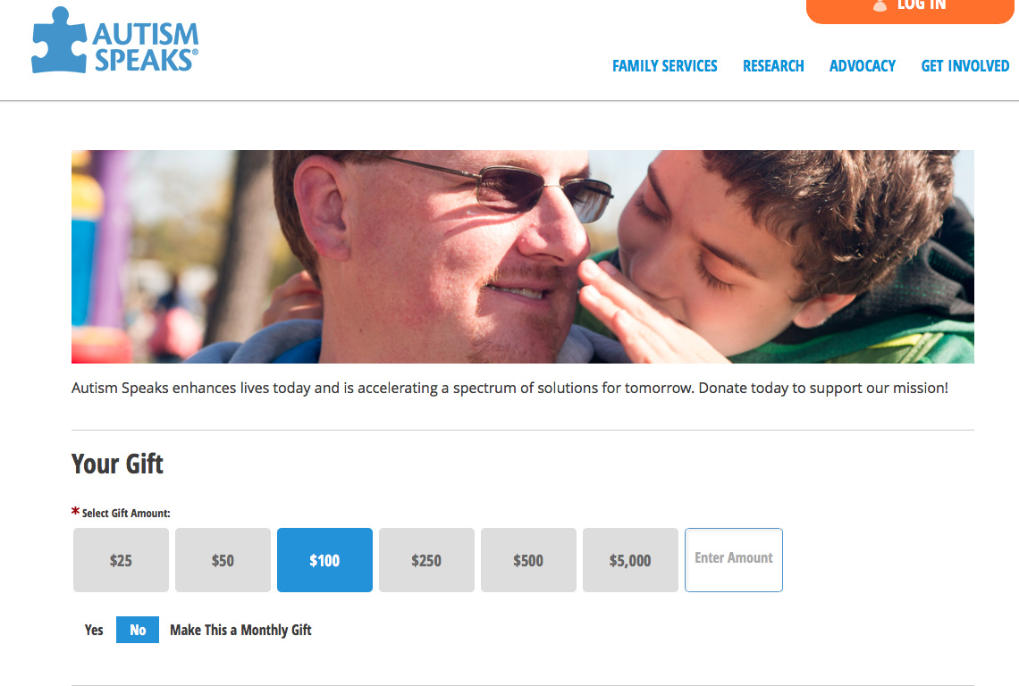
Most websites have a lot going on: Top navigation, search tools, email opt-ins, side bar navigation, ads highlighting programs, promotions for events, and much more. There’s a time and place for all of those things, but the donation form isn’t it. When someone lands on your donation form, they should see and experience a simpler page – one that makes completing the action of donating easy. Check out what Autism Speaks does. Here are a few key things they’ve done to simplify their donation form: Expert tip: Take a tip from @autismspeaks, remove as much as humanly possible from your donation form. 6) Reduce, Reduce, Reduce
One more time, Reduce! People don’t like to give away too much information or spend a lot of time filling out long forms. Be sensitive to this and make sure to limit your donation form to only the fields you need. Keep your donation form data collection lean – asking only for the information needed to complete the online transaction. My colleague Amy Bills has some additional questions you should ask yourself when determining how to simplify your donation form. Expert tip: Simplify your donation form and get more people to make online donations. 7) Use Giving Levels
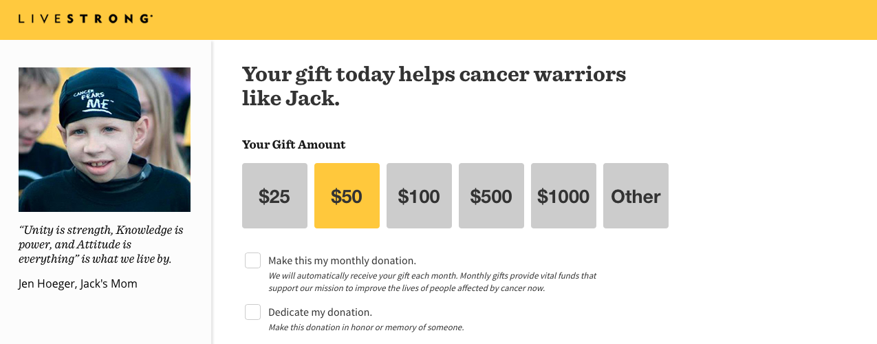
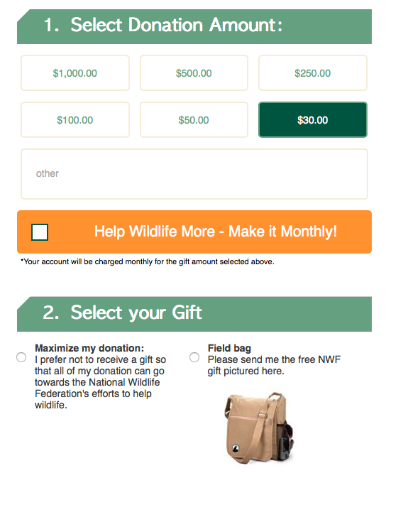
Research has shown that suggesting giving amounts leads to improved donation form performance by increasing average online gift size. It’s a simple concept, really. Instead of asking people to type in the amount they want to give, suggest a handful of amounts. The goal is to get people to give larger amounts than they would if left to make their own, unaided decision. Livestrong starts their giving levels at $25 and goes up to $1000. They also include a box for “other”, so that people can choose to give a different amount. Expert tip: Use donation form giving levels like @livestrong in order to increase online donation. 8) Encourage People to Give Monthly
Getting a one-time gift is great, especially if that gift is a big one. But receiving a monthly recurring gift, even if for a smaller original amount, is so much better! By getting a new donor to give monthly you’ve done a few things: Make sure you offer a simple way for donors to opt-in to monthly giving. Expert tip: Enable monthly giving to improve online fundraising performance! 9) Give People a Way to Stay in Touch
This one is simple. If a person gets to your online donation form, pulls out their credit card and decides to give you money, it’s likely they’d be open to hearing from you again. It might also be the last real opportunity you have in which the person is this eager to interact with your nonprofit. Take advantage of this opportunity you have to build your email house file by making it easy for people to opt-in when they donate by checking one simple box. I hate to do it again, but here goes—charity: water makes opting into their regular email communication simple for donors (see previous section screen shot above). Expert tip: Build long-term relationships by making it easy for donors to opt-in to your email list like @charitywater. 10) Add Social Proof
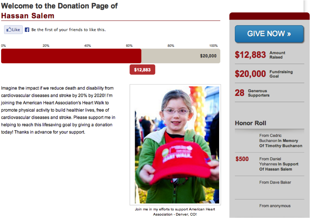
Have you ever done a fundraising event like the Susan G. Komen three-day walk or the Heart Walk by the American Heart Association? These types of events do an excellent job of exercising social proof. Essentially, social proof is the demonstration that others have gone before you and done it. They’ve purchase that book, tweeted that page or shared that photo on Facebook. In the context of online fundraising, social proof is showing potential donors that others have supported the cause and that money has been raised. In the screen shot above, you’ll notice that the fundraising goal, amount raised, and number of donors, are visible on the online fundraising page. How could you take this concept and implement it on your standard donation form? Expert tip: Use “Social Proof“ to help new online donors gain confidence and give that first gift! 11) Put Security First
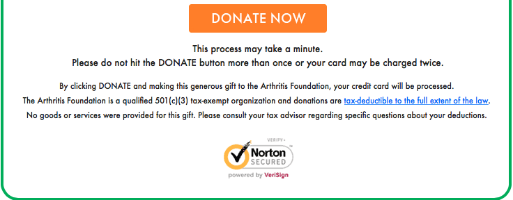
Financial transactions have become commonplace on the internet, but people still like to know that you’re taking the appropriate precautions to ensure their information is secure. The Arthritis Foundation added a simple Norton/Verisign logo to the bottom of their donation form and a BBB and SiteLock logo in the footer. Potential donors will see these signs of security as they’re about to click the donate button, even if they are not intentionally looking for them. Doing this builds trust and confidence. Expert tip: Prove your website is secure and build trust with online donors like @arthritis_org does. 12) Be Transparent
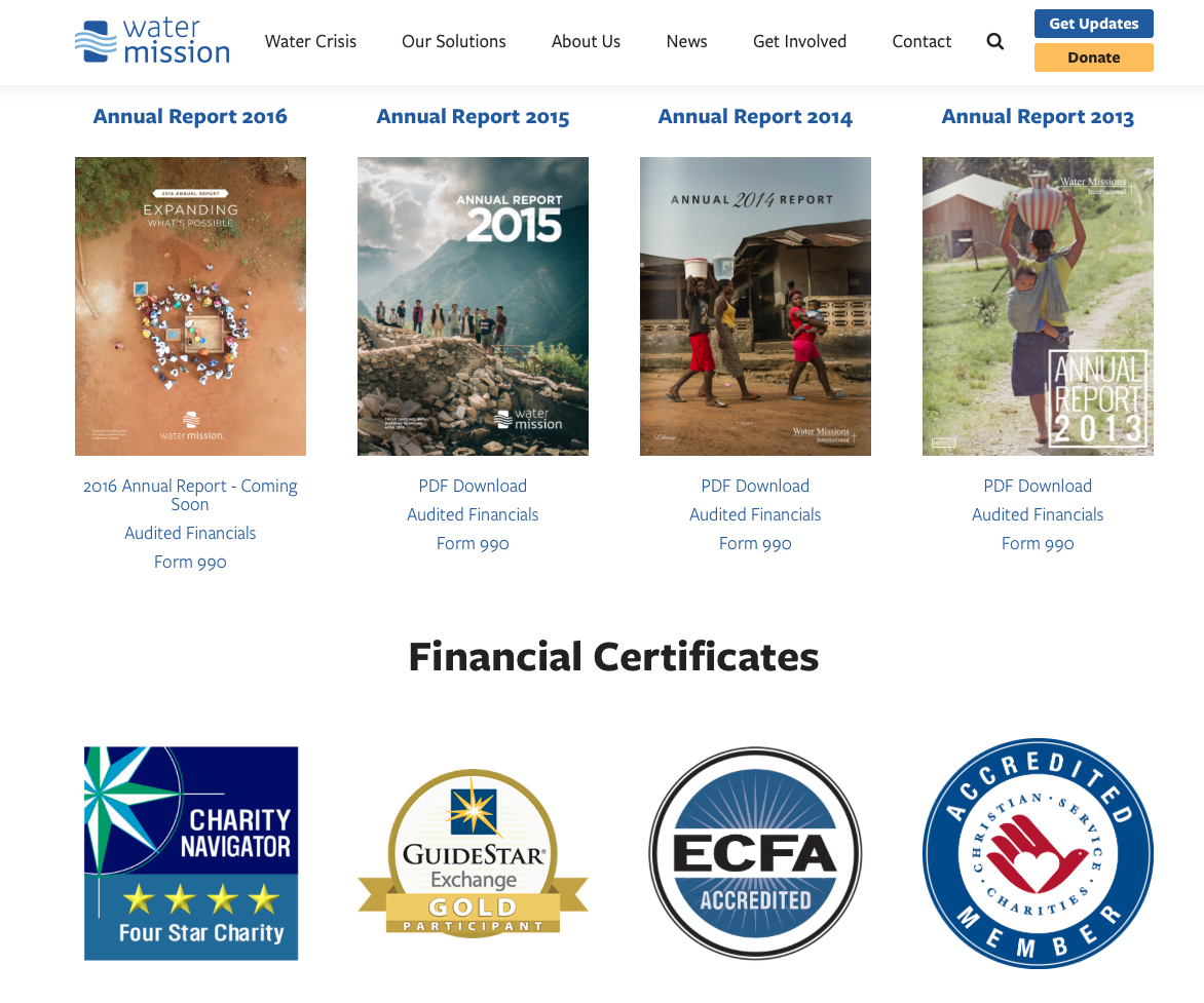
Nonprofits are being called to a higher standard of transparency because donors what to know how their money is being used and what type of impact your organization is making (Madeline Turner has a few thoughts on showing your impact). Instead of placing a blind trust in charitable organizations potential donors can go to folks like Charity Navigator who rate charities and provide information on the percentage of each donation spent on charitable programs versus overhead expenses. How are you responding? With the increased call for transparency nonprofits like water mission have put their financials front and center. They make their financial information easily accessible so that supporters can feel confident in how their donation is being used by the organization. Expert tip: Take transparency in online fundraising seriously like @water_mission Share your financials freely. 13) Give Donors Something Nice
This one can be tricky, but if done well it can have a lasting impact on donors. Giving donors a gift for making a donation is a great way to show donors (especially new ones) your appreciation while also providing them with a banded piece that will remind them of your nonprofit every time they use it. National Wildlife Federation (NWF) has done a great job with their gift. Here’s why: Expert tip: Use gifts that align with you mission (like @NWF) to show appreciate to online donors. 14) Take Advantage of the Moment
You’ve got a great opportunity immediately after someone has given you an online donation. They’ve made a decision to invest in you and they’ve pulled out their wallet to do so. There are a two key places you can take advantage of this moment: Expert tip: Ask new donors to opt-in to your email and spread the word via social media right after they give. 15) Don’t Forget About New Donors!
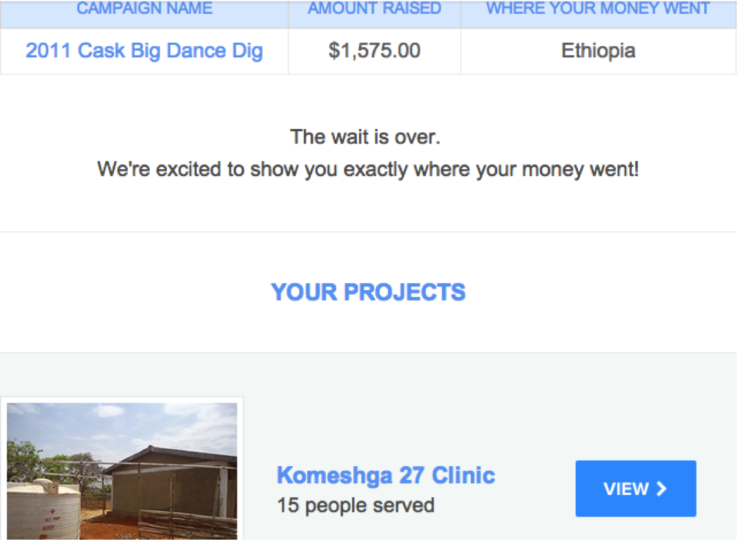
Showing donors how their money is used can have a huge impact on donor engagement and long-term retention. People want to know how you’ve made the world a better place. Take a page from the charity: water online fundraising book and make sure to remind donors how their money is being used (see above), the impact it’s having and about your gratitude for their support. Email has made this type of communication extremely simple. Expert tip: Show donors how their money has been used to make the world a better place. Your turn …
Hopefully the 15 tips above have given you some new ideas and/or sparked thoughts on how you can improve your online fundraising program. I’d love to hear back from you. Which tip was the most useful to you?