6 Ways to Stop Your Website from Leaking Potential Online Donors

A report released earlier this year by the UK User Experience Agency Nomensa indicated 47% of people who visit a website intending to make an online donation give up before completing the process.
Yes, 47%!
How frustrating.
Which leads me to the main point of this post. Getting visitors to your website is only half the battle. Once there, nonprofits need to inspire, overcome reservations and make it easy to make an online donation.
How, exactly, can you accomplish these things and ensure more potential donors complete the giving process? Here are a few ideas for you.
1) Allow giving to specific projects
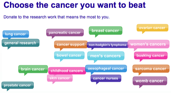
I know unrestricted money is your top priority. But it may not be a donor’s top priority.
If they’ve lost someone to breast cancer, they’re most likely interested in funding that type of cancer. Instead of just offering what you want (annual fund, matching gifts, etc.), let donors also give to projects that are meaningful to them. The Nomensa report offers a great example from Cancer Research UK:

2) Offer the opportunity to “join the club”
Monthly giving is important. In addition to Frank Barry’s recent post on why you need a recurring giving program, the just-released 2012 eNonprofit Benchmark study found that online monthly giving is growing at a much faster rate than one-time giving.
But don’t just offer recurring giving. Brand it as an exclusive, meaningful, and fun online experience. Some nonprofits do this by asking monthly donors to “join the club” and give them names like Miracle Makers, Partners for Change, and Guardian Angels.
Create your own “club” with perks that enhance the giving experience. Things like first-to-know email alerts, discounted store purchases or drawings for celebrity meet-and-greets. Also, detail how monthly donations impact your mission. Let monthly donors know they’re part of a team really making a difference.
3) Creatively convey how donations are used
The 2011 Money for Good study found that donors are looking for information on how donations will be used.
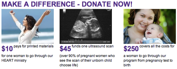
Although this is a common theme in many studies, it still is overlooked. And while it’s important to say how donations are utilized, you don’t always have to use long paragraphs to explain this. Be creative here. Incorporate visuals and shorter text to communicate the impact of gifts. Here’s one example I like:

4) Providing (unbiased) proof you’re legit
The 2011 Money for Good study also found that even though donors rarely research organizations, they want to give to reputable nonprofits that won’t waste their money.
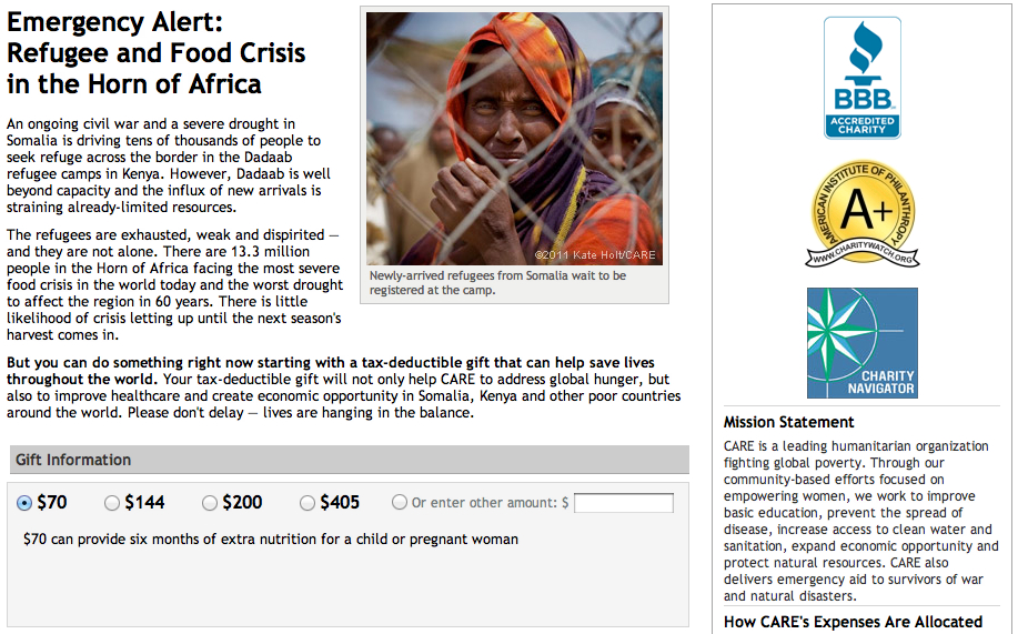
So, be transparent about how donations are used and provide (unbiased) proof that you can be trusted. Use logos from and links to ratings by Charity Navigator, GuideStar Exchange, Better Business Bureau, and other third-party organizations to show donors you’re responsible. The right column of CARE’s donation form provides all of this:

5) Add a compelling photo to your donation form
Motivate and engage donors on every step of the donation journey, including your donation form. Remember, visitors may be considering making a donation at that point.
Or, perhaps past donors are considering a larger gift. Use a compelling photo that inspires donors. Those of someone or something looking into the camera work well. CARE’s example above does this well, as does this one from The Peregrine Fund:

6) Create a feel-good post-donation experience
Does your confirmation page and email just regurgitate payment information? Is it a lukewarm “thank you?”
Be creative and leave no doubt about how appreciative you are. Help donors walk away from your website feeling great about themselves and the financial sacrifice they just made. Here’s what one organization includes on their confirmation page:

Make them believe their gift will make a difference for someone. Create a feel-good experience that begins the cultivation process for the next gift.
What other ways can you think of to enhance the online giving experience?
Make sure to check out Steve MacLaughlin’s post on 5 Donation Form Bad Practices to avoid.
2011 Online Giving Report
Download the complete 2011 Online Giving Report to learn more about the 13% YoY growth in online giving, the double-digit growth since 2009 and the reasons your nonprofit should invest in its online fundraising program.
