Designing Nonprofit Experiences
The following article was originally published in the June 2014 issue of User Experience Magazine. Reprinted here by the author.
Designing nonprofit experiences can be quite different from designing retail or commercial experiences. Nonprofits aren’t selling a product or a service; they’re selling a cause and a set of values. The hope for a nonprofit is to find users who are passionate about their cause and to motivate those users to become donors, volunteers, advocates, even fundraisers.
While there are many differences in nonprofit versus for-profit design, there are a lot of UX techniques we can borrow from one another. A glimpse at what the “other side” is doing can provide new tricks for our toolkit.
Borrowing For-profit UX
I like to compare the nonprofit design world to small town fashion. When a trend takes shape in the big city (for instance, for-profit companies), it often takes some time for ?it to trickle down to the small town? (nonprofits). The rotating image carousel is a good example. While this trend seems to be on the decline on for-profit sites (hallelujah!), most nonprofits I work with simply aren’t ready to part with it.
User-centered design
The trickle-down effect has worked its magic over the last few years and most nonprofits now truly embrace user-centered design. Based on what I’ve read and heard throughout the industry, we follow the same general design process that most for-profit designers follow:
- Stakeholder discovery
- User research
- Content strategy
- Information architecture
- Visual design
- Implementation
It’s a good thing that nonprofits have hopped on this bandwagon; understanding users is very important for a nonprofit since they’re looking to build long-term relationships with these folks.
For this reason, we try to incorporate some user research into every nonprofit design project we do. Most of our user research techniques are likely the same as what’s in any designer’s toolkit: surveys, interviews, analytics review, usability tests, etc. Personas play a valuable role for nonprofits since they help describe the personalities of the users, which is important when you’re trying to tug at the heartstrings.
User research can also benefit nonprofits when designing communications beyond the website. Nonprofits have come a long way over the years with user-centered communication strategies. Tracking offline and online behaviors in a single database is either a reality or an imminent goal for every nonprofit I’ve worked with. This holistic view of constituents allows the nonprofit to tailor communications to each user based on their point of origin and their previous interactions with the organization.
Closing the sale
While there are many ways for users to engage with nonprofits online, making a donation is almost always a key indicator of success. Because of this, we need to provide a quick and easy pathway to donate from anywhere in a nonprofit experience.

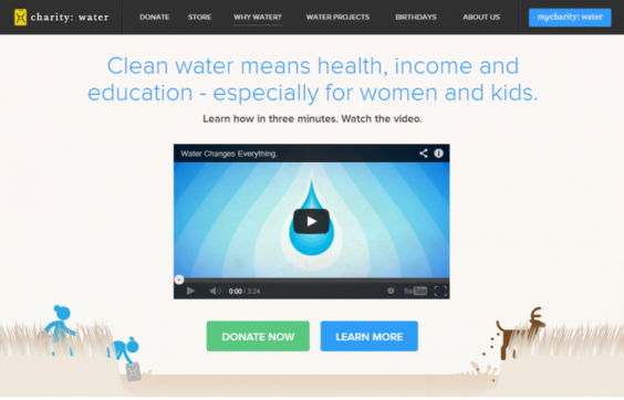
The giant, ubiquitous donate button (see Figure 1) is definitely something we’ve borrowed from the for-profit “Buy Now” button; I don’t see it going away any time soon.
Another tactic we borrow to encourage donations is to communicate a tangible benefit of donating. Users are accustomed to retail purchases where spending money results in a new object or service rendered. Spending money on a nonprofit site is different because the user doesn’t directly benefit from the purchase. To infuse the donation experience with a tangible aspect, some nonprofits, especially public radio stations, will offer a “premium” or gift with a donation, like a coffee mug or a DVD.
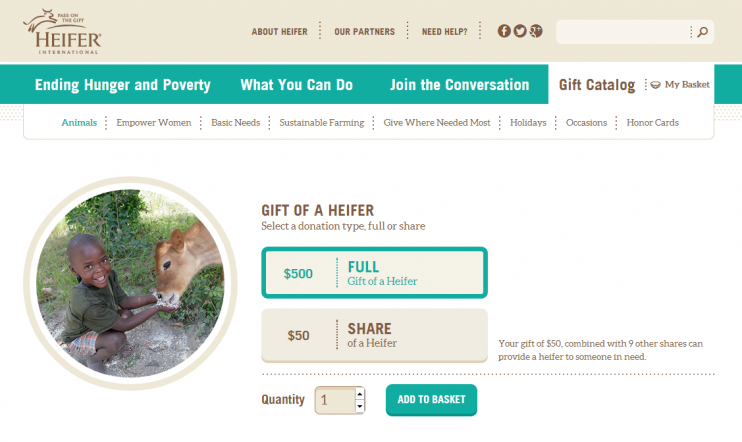
Many nonprofits have started offering gift catalogs where users get the satisfaction of actually buying something with their donation. The donation process will then take the user through the same steps they’re accustomed to for any ecommerce purchase. These catalogs have been very successful for nonprofits like Heifer International (see Figure 2).
Social media and peer-to-peer
Almost all nonprofits have hopped on the social media bandwagon. Thanks to the pioneering for-profit world, all of my clients at least have a Facebook page and Twitter account and post meaningful messages and calls-to-action for their followers on a frequent basis.
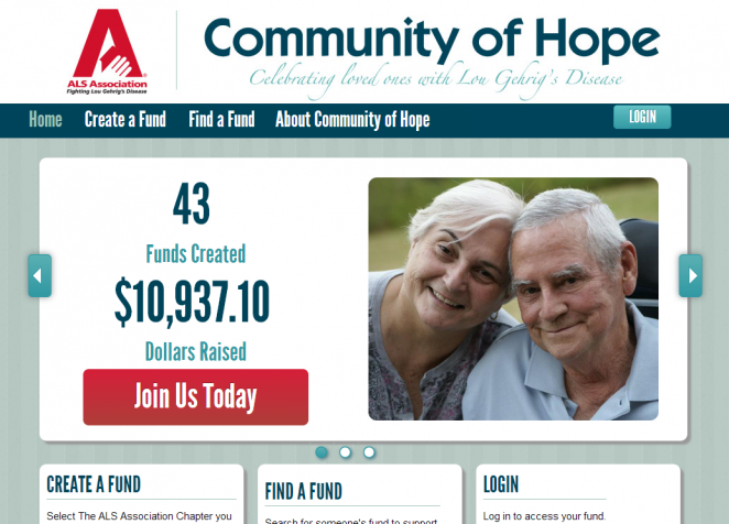
I think the rise of social media has also been the impetus for the rise of Peer-to-Peer (P2P) Fundraising, which is really hot in the nonprofit space these days. The concept is based on participants who sign-up online, create their own personal fundraising web page, and send it to their family and friends to solicit donations. The cause can either be an actual event, like a run or walk, or it can be “just because,” like an honor or memorial page for a loved one (see Figure 3).
P2P Fundraising campaigns are much more successful when participants use social media to solicit donations. We also like to include social commenting widgets on the participant’s fundraising pages to create an instant conversation. Social media has opened up a new, extra-wide avenue to raise awareness about fundraising on behalf of a nonprofit.
Learning from Nonprofits
While nonprofits are often slower to adopt web design and marketing trends, there are several practices that are ingrained in the nonprofit design process that can be useful for commercial designers as well.
Wrangling stakeholders
Stakeholder input is an important part of any design process. When designing for nonprofits, we are often faced with conflicting opinions among different stakeholders and/or departments, and part of our job is to align everyone’s expectations. This same scenario arises for many for-profit designs as well, but we find that nonprofits use a committee-based decision making process more frequently.
I’ve found that the best way to gather stakeholder input is to keep the conversation focused on the goals for the new web presence and to document those goals along the way. Typically, I’ll meet with several groups of stakeholders, so keeping a running list is a great way to maintain continuity throughout the process.
I’ll start with a list of goals, validate them with the first group, and add to the list and revise as needed. Then, with the next group of stakeholders, I’ll present the same goals and again add/revise. The final deliverable to all stakeholders will be a consolidated list of goals that they will have to collectively approve before we proceed. That list will appear again and again throughout the design process to keep the entire team focused, especially when many stakeholders are involved in the process.
Encouraging exploration
One goal that all nonprofits share is to educate their website visitors about their mission. For this reason, it’s important that we encourage learning and exploration through well-designed information architecture. While most for-profit sites are primarily structured to close a sale, learning and exploration can be a goal as well.
One of the techniques I use to encourage learning and exploration is to structure the main navigation in the order I’d envision a user building a relationship with the organization. First, they may want to learn some basic facts, history, and read some stories about how the organization makes an impact. Then, they may be interested in how they can get involved through online activity (email subscription, social sharing), political advocacy, or even volunteering. Finally, the user might decide to donate to the organization.
Thus, the main navigation might read:
- About Us
- Stories and/or News
- Get Involved
- Donate
Since the “Donate Now” button is usually a must-have, this particular navigation item will likely look a bit different so that it stands out on the page.
Another way we try to encourage exploration is by offering the user content filters so they can take a “choose your own adventure”-type path through the site (see Figure 4).

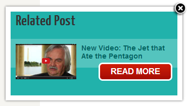
Additionally, we use the same topic categories to display related content items at the end of the page so that users can continue reading content on the same topic. Recently on a nonprofit client’s blog, I incorporated a related item feature that pops up in the bottom right corner of the page when the user scrolls to the end of the post (see Figure 5).
Storytelling
In the same vein as encouraging exploration, finding creative ways to tell stories is a goal for all nonprofits. Stories are our best chance to build an emotional connection with a user that will drive that user to a relationship with the organization. Many for-profit companies have a need to tell stories to raise brand awareness and, ultimately, to create loyalty from customers.
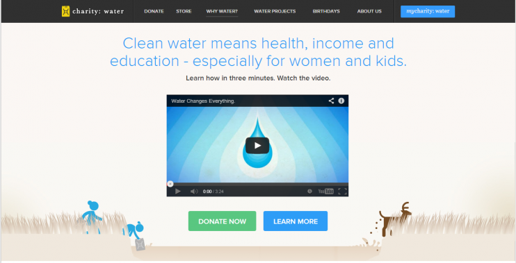
One way nonprofits have had success storytelling is through videos. Charity: Water is a nonprofit site that is admired for their compelling design and messaging. Their website uses videos to tell stories and create an emotional appeal. Their “Water Changes Everything” video conveys, in three minutes, why people should care about their mission. They use animation for this video but have also had great success with live action videos.
Invisible Children also had great success storytelling via video with their Kony 2012 campaign. According to Wikipedia, Kony 2012 was a 28-minute video produced by Invisible Children to “promote the charity’s ‘Stop Kony’ movement to make African cult and militia leader… Joseph Kony globally known to have him arrested by the end of 2012.” “The film had over 97 million views on YouTube, over 21.9 thousand likes on Vimeo, and was called the most viral video ever by TIME Magazine.”
Often nonprofits struggle to write really good stories to feature on their website. To overcome this, we solicit user-generated stories from visitors to the websites to both help with content development and provide another avenue for users to “get involved.” Their stories are then published on the site for other users to read and enjoy.
Learning from Each Other
One of the reasons I love working in UX is that I can learn from examples of good UX I see everywhere. Just by tuning into my own experiences when visiting for-profit websites, I’ve been able to offer and implement new ideas for my nonprofit clients. My hope is that by hearing about my experiences, other designers will be able to apply these techniques to their own work and I’ll be returning the favors I’ve borrowed over the years.
