How to Make Small Changes for Big Impact on Your Donation Form

Your online donation form is one of the most important components of your digital fundraising efforts. How important? Charitable gifts donated through online sources increased by more than 50% in the last year. For this reason and more, building and optimizing your donation form is a must. The good news is that even small changes can have a big impact.
The Impact of a More Effective Donation Form
Well-designed donation forms offer multifaceted benefits.
- More completed donations: Simplified processes and user-friendly design increase the likelihood that visitors won’t abandon the gift-giving process before it’s complete.
- Increased gift amounts: Strategic prompts, matching gift availability, and suggested donation amounts can lead to larger gifts.
- Better user experience: A smooth, hassle-free donation experience leaves a positive impression, fostering long-term relationships.
- Improved donor retention: A positive initial giving experience increases the chances of retaining donors for future contributions.
- Superior data collection: Optimized forms capture accurate and useful donor information, aiding in future engagement and personalized outreach.
- Increased matching gift participation: Highlighting matching gift opportunities encourages donors to maximize their contributions, potentially doubling or tripling donations.

For many donors, the online giving page is the donation experience. You want them to have a good one, and you want them to continue supporting your cause.
Physical Components to Include on Your Donation Form
Your donation form is a tangible tool to collect information from your supporters. There are a number of physical characteristics you should include in this form—we’ll cover our top suggestions here.
Easy-to-find donate button
The donate button is arguably the most critical element of your giving page. It needs to be highly visible and easy to find, as it directly affects the likelihood of a visitor completing their donation.
- Position: Prominently place the donate button in a bright, contrasting color.
- Convenience: Ensure the donate button is easily accessible on all parts of the page, including from the navigation menu, to increase the chance of converting visitors into donors.
Variable payment options
Offering variable payment options is essential for accommodating the diverse preferences of your donors. Some people prefer to give via credit card, while others may opt for less conventional methods:
- PayPal
- Bank transfers
- Digital wallets, such as Apple Pay or Google Pay
Offering multiple payment options removes potential barriers to giving. If a donor’s preferred payment method isn’t available, they may abandon the donation process, leading to lost opportunities for your nonprofit.
Recurring giving functionality
When a donor accesses your donation form, they may intend to make a single, one-time gift. However, a form equipped with recurring giving functionality allows donors to contribute ongoing donations according to a pre-approved schedule. You might be surprised how many donors opt to make the upgrade when it’s available.
Many supporters are willing to give smaller amounts regularly rather than larger sums all at once and offering the recurring giving option on your donation form can lead to higher overall donations over time. Recurring donations also help with financial planning and ensure more predictable revenue for your organization.
Matching gift information
Including matching gift information on your donation form is an effective way to maximize contributions without asking donors to give more themselves. Many companies offer matching gift programs to match their employees’ charitable donations, sometimes doubling or even tripling the donation amount. Informing donors about these opportunities and instructing them how to submit a matching gift request can significantly increase the impact of each donation.
Mobile optimization
With an increasing number of people accessing websites and making donations via mobile devices, mobile optimization is no longer optional—it’s a necessity. A donation form that isn’t mobile-friendly can be difficult to navigate on a small screen, leading to frustration and abandonment. A mobile-optimized donation form improves the user experience in several ways:
- It loads quickly
- It is easy to read, and features large, tappable buttons and input fields
- It makes it easier to give on the go, whether donors are using a smartphone or tablet
Consider the Emotional Aspects of Your Donation Form
In addition to optimizing the tangible components of your donation form, you also want to be deliberate about its emotional positioning. We recommend focusing on the following ideas as you draft or edit your giving pages.
Impact
Donors want to feel that their money is making a difference. When you clearly illustrate the real-world impact of their donation, it can significantly influence their decision to give.
- Get specific: Detail what a particular donation amount can accomplish (“$50 provides meals for a family for a week”)
- Show, don’t tell: Share stories and visuals showing how donations have been used
When donors understand the tangible outcomes their gift will support, they’re more likely to feel satisfied with their contribution, which can lead to repeat giving.
Transparency
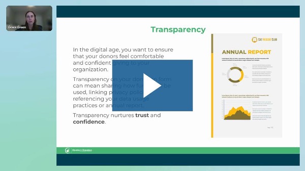
Communicate to supporters how donations are used, where the money goes, and what percentage of the funds are allocated to various areas such as programs, administration, and fundraising.
Transparency builds trust between your nonprofit and potential donors. When donors feel confident their contributions are being managed ethically, they are more likely to give and continue supporting your nonprofit over time.
Timeliness
You want to convey relevance and urgency in your donation appeal. It’s important to frame the donation request in a way that highlights the immediate need or specific timing of the donation’s impact. This could be related to a current campaign, an emergency situation, or a matching gift deadline.
By creating a sense of urgency, you motivate donors to act quickly rather than delaying their decision to give. For example, a statement such as, “Donate now to help us reach our goal by the end of the day,” encourages potential donors to contribute promptly, ensuring that their gift is relevant to the immediate needs of your organization and its mission.
Gratitude
Showing appreciation to donors is essential, but it doesn’t have to be complicated:
- Say thanks more than once: Include a heartfelt thank-you message on the donation confirmation page and send a prompt acknowledgment email
- Make it meaningful: Gratitude humanizes the donation process, reminding donors that their gift is not just a transaction but a meaningful contribution to a cause they care about
Taking It a Step Further: Fine-Tuning Your Donation Form
When you’re ready to go above and beyond standard practices, incorporate the following advanced tips into your strategy.
Effective branding
Consistently use your organization’s colors, logo, and other visual elements on your donation form. When donors see that your donation form matches the branding on your website, emails, or social media, they’re more likely to feel secure in their decision to give. Branding also conveys your organization’s mission and values, making the donation experience more meaningful overall.
Suggested donation amounts
Preset giving amounts provide a reference point, making it easier for donors to choose how much to give. Gift suggestions also have a psychological effect; when donors see higher suggested amounts, they may be inclined to give more than originally planned.
Offering a range of options, such as $25, $50, $100, or a custom amount, accommodates different donor capacities while gently encouraging higher contributions. Suggested donation amounts also simplify the decision-making process, reducing cognitive load, which can lead to increased conversion rates.
Blackbaud Donation Forms now offers Intelligent Ask, an AI-driven feature that presents personalized one-time gift amounts to online donors. This tool leverages data such as the donor’s location, device, browser, and other insights to suggest the amounts they are most likely to give, ultimately helping you raise more money.
Accessibility
Your donation form needs to be usable by everyone, including individuals with disabilities. An accessible donation form adheres to best practices such as providing alternative text for images, ensuring screen reader compatibility, and allowing keyboard navigation—including for any embedded software widgets. Inclusivity fosters a positive user experience, enhances your organization’s reputation, and increases the likelihood that all supporters can contribute to your cause.
Trust indicators
Trust indicators are elements that reassure donors of the security and legitimacy of your donation process. These can include SSL certificates, secure payment gateway logos, or even charity ratings from organizations like Charity Navigator or GuideStar.
When donors see these indicators, they’re more likely to proceed with their donation, knowing that their personal data and payment information is protected and that their contribution will be used effectively.
Matching gift search tool
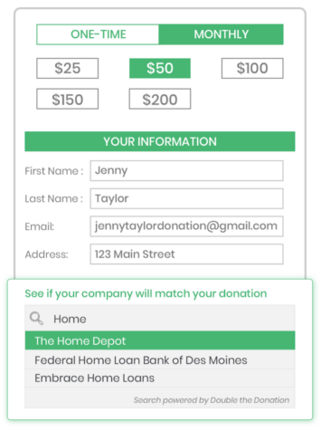
Millions of donors qualify for matching gift programs, but the vast majority remain unaware of the opportunity. Fortunately, implementing a matching gift search tool on your donation form allows donors to quickly find out if their employer participates and how they can get involved.
Embedding this tool in your donation form empowers donors to maximize their contributions, potentially doubling or even tripling the impact of their gift without requiring them to give more.

Providing a matching gift tool benefits your organization financially while enhancing the donor experience, as they feel they are making an even bigger difference.
It’s easy to add Double the Donation’s matching gift search tool to your Blackbaud donation forms, thanks to the seamless and ready-built integration between the platforms.
Technical performance
A fast-loading, glitch-free donation form is essential for preventing donor frustration and abandonment. If your form is slow, unresponsive, or prone to errors, donors are more likely to give up before completing their donation.
Fortunately for you, regularly testing and optimizing your form’s performance can improve user satisfaction, reduce abandonment rates, and ensure that you don’t miss out on potential donations due to technical issues.
Make Small Changes Today
As you implement these optimizations, even the smallest adjustments can lead to big results. You can see a significant impact on your fundraising results overall, maximizing the effectiveness of your donation form and driving better outcomes for your cause.
For even more insights, check out the Small Changes, Big Impact webinar series to see expert advice in action.
