Keeping your Email Simple (and Mobile-Friendly too!)

Surprise, it’s December! Are your end-of-year fundraising emails ready to go out? Regardless of how prepared you are with your messaging, it’s important to take a moment to consider your readers’ context. Dennis McCarthy cited a stat in his recent post that 36% of email is now read on a mobile device. I’d be willing to bet that percentage increases a bit during the holidays with so many people on-the-go. The good news is that it’s not that difficult to make sure your email will look good on my mobile device. The key is to make sure your email layout is simple. Here are a few tips…
Limit your use of images
In my email program on my phone, I have to scroll all the way to the bottom of the email to load the images:
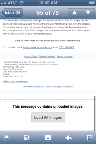
To be quite honest, I didn’t even know I could load images in emails until I sat down to start writing this blog post. Therefore, the likelihood of your constituents taking the time to do this with your email message is extremely low. My suggestion is to keep images to a minimum in your year-end emails. And definitely don’t rely on images to display your key messaging and calls-to-action.
Don’t include a right column
Many of our client’s go-to email templates include a right column to allow for cross-promotion of other content and calls to action. If this is you, I encourage you to lose the right column. Your messaging should be succinct and direct so anything you present alongside it is likely to detract. Plus, it’s much more difficult to make a two-column email render nicely within a mobile device.
Here’s an example of a two-column email I received that is really difficult to read on my phone. Not to mention, I had to load the images before I could see half of the message:

Make sure buttons and calls-to-action are tappable
The Apple-suggested standard for mobile-friendly buttons is 44px square. I suggest avoiding text links and instead using larger buttons for any calls-to-action you include in your message. Per my suggestion above though, be sure your buttons don’t rely on images for display – use CSS instead.
Test, Test, Test
Be sure to look at your test emails on your mobile device (and your co-worker’s device). Make sure you don’t have to do the pinch and resize to be able to read the text and that the messaging comes across clear on various platforms.
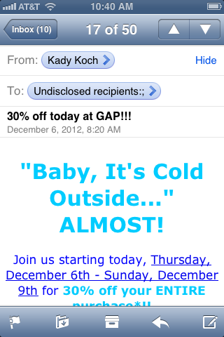
Here’s an example of a simple text-based email I received from my local Gap store. While it could definitely benefit from some design and tappable buttons, I like that it’s simple, readable and to-the-point:
It’s worth noting that you can also design a separate, mobile-friendly version of your email or, better yet, develop a responsive email template that will resize your message according to device. If you’re in a rush though, (and who isn’t this time of year?!) this may be a daunting suggestion. Keeping your original message simple per the tips above will go a long way in reaching your mobile constituents.