New Year, New Web Design Trends

How is it already 2013? I realized today that I’ve been designing websites for 10 years! With a decade under my belt, I thought I’d share some observations about how I’ve seen web design evolve over the years to hopefully inspire you to incorporate some of these trends into your own website for 2013.
Flatter is better
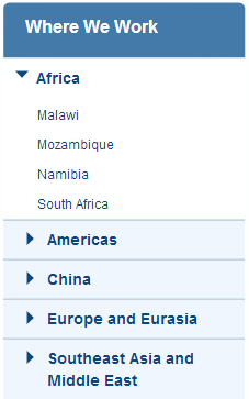
The earliest Information Architecture work I did had layers and layers (and layers) of content. For some websites, I remember having four tiers of navigation. For example, to learn about the work an org was doing in a specific country, you’d click: Home > Our Work > Where We Work > Africa > Malawi.
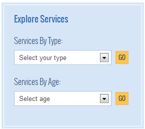
With the adoption of CMS tools, it’s easier to give users faster access to the information they want by offering self-select content filters. So in today’s world, the Malawi example would look more like: Home > Our Work > drop-down box to “View Work by Country” where the user could select Malawi. Alongside the “View Work by Country” box, I may also offer options to “View Work by Topic” or “View Work by Date”. The fewer tiers you offer, the easier it is for your users to navigate and the easier it is for you to maintain.
Bigger is better
While some of us may be looking at 2013 as the year to lose weight, I’ve seen web designs gaining weight over the years. Technology has come a long way in affording us the luxuries of using larger, more compelling images, bigger, easy-to-read font sizes, and bulkier, louder buttons, headlines and calls-to-action. The new World Wildlife Fund website is a great example of this. Using larger graphics makes it easier to establish visual hierarchy on your pages since you have more variables to work with. Plus, it just looks better!
Simpler is better
This trend is more of a summary of the previous two points but I think it’s worth calling out. Every client I work with lately asks for a “cleaner” and “simpler” web presence. We’ve thankfully moved away from cluttering the homepage with multiple, competing messages and instead are focusing on 1-2 key takeaways and a few, timely updates. Simpler goes for section landing pages too. Offering succinct descriptions of what users might find deeper within the section encourages exploration on the user’s terms.
Mobile becomes easier
The beauty of all of the latest web design trends is that they make it easier to go mobile. Flatter navigation is easier to translate into a mobile experience. Bigger buttons and headlines make for more tap-friendly interfaces. And simpler websites make for faster absorption in a desktop or a mobile environment. I see this as a chicken or the egg scenario: is mobile the impetus for these design trends or are these trends influencing how we design for mobile? I’d love to hear your thoughts in the comments!


