The Anatomy of an Email Sign-up Thank You Page, Revisited

As I started writing this post, it felt eerily familiar. I looked back through the archives and found that I’d written a post of the same title back in 2012! While the examples are outdated, most of the information in that post is still relevant. Take a moment to read it – I’ll wait.
Today’s post shares data from an organization that has seen some awesome results after following some of the best practices for their email sign-up thank you page. When IndyHumane redesigned their website, they incorporated an omnipresent, highly-visible email sign-up box just above their page footer:

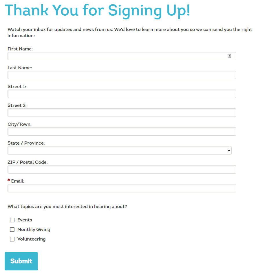
This form is beautifully simple in that it only requires the constituent’s email address, which is enough data to start a conversation, but why not take it further? You know that giddy, excited feeling you get when you first meet someone you like? That’s akin to how your brand-new email subscribers feel. They’re excited they found you and eager to learn more and share more. As such, Blackbaud recommended that IndyHumane follow-up with a survey to collect the subscribers’ names and other important data. Here is a screenshot of that page:

Two months after this new form went live, I ran a quick check on their data to see how many subscribers had completed the second form. I was amazed to discover that 86% of email subscribers completed the second form! From a cursory look at the data, almost all of those form completions included some additional contact information and/or Interest data. This additional step and the data collected from it can help IndyHumane (and you!) develop deeper relationships with these new subscribers and tailor communications based on constituents’ interests.
What does your Email Sign-up thank you page look like? Are you taking advantage of this moment of peak interest and giddiness to learn more about your subscribers? I’d love to hear your results and ideas!
