“Unsubscribe” is not a Dirty Word in Email Marketing

As a user experience consultant at Blackbaud, I’m often tasked with reviewing a nonprofit customer’s email messages to see if any improvements could be made. One of the improvements I often suggest is to make the unsubscribe link easier to find. Let’s face the facts here – we all have them, so why hide them?
In the earlier days of email marketing, “unsubscribe” was kind of a dirty word. List growth was all the rage and quantity (i.e. the size of your list) seemed more important than quality. We had to include the unsubscribe link but we always put it in tiny print at the bottom of our emails and often used different verbiage to disguise it.
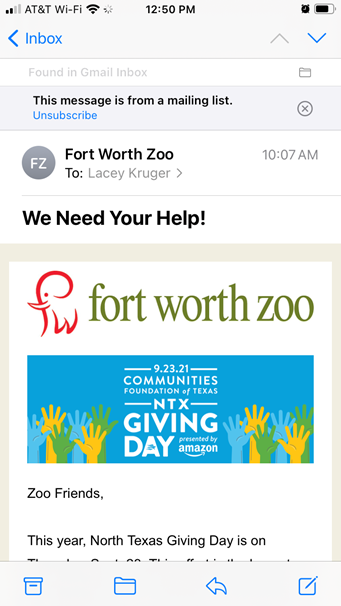
In recent years, that dynamic has shifted. Email providers like Gmail have cracked down on emailers to try to improve the user experience for their email users and limit the volume of email one person receives. One of the ways they do this is by adding an easy way for Gmail users to unsubscribe in the header of your message:

This article does a great job of explaining why this is actually a good thing for us as marketers. In today’s world, making it easy for your constituents to unsubscribe is the right thing to do. It improves their experience with your organization and having an engaged list will also improve your email deliverability for those constituents who want to hear from you. (for more info on email deliverability, check out Blackbaud’s Email Resource Center)
So, how do we improve our Unsubscribe placement? Here are 3 rules to guide you:
- Always use the word “Unsubscribe”. You aren’t going to improve your metrics by hiding this required link behind some flowery description.
- Use the same font size that you use for other text around it. It’s likely going to be in your email footer, so use the same text size that you use for other items in the footer.
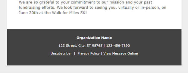
- Indicate that it’s a clickable link by using the same link style as other links in your email. If your footer has all blue underlined links, your unsubscribe link should be the same.
Here’s a quick visual:

If you want to add a little personality to your unsubscribe link, feel free to add some cheeky language such as, “We hate to see you go but you can Unsubscribe Here”. If you do this, just be sure you still follow the three rules above.
Now go forth and update your email footers! Your subscribers will thank you.
