Demystifying the Predictive Model
We’ve all heard the rumors about using predictive models with fundraising campaigns: Raise your revenue by 300%! Reactivate your whole lapsed file! Reverse signs of aging by 30 years! OK, that last one wasn’t related directly to fundraising, but it is just as unlikely.
So what are predictive models and how do they work? Let me try and break it down (in 500 words or less!). Word of caution – this is designed for non-statisticians!
Patterns in Data
The idea of any type of predictive analytics is to identify patterns in the data and interpret the results into an actionable item. Models use data to identify relationships between variables and the likelihood that an action will achieve a desired outcome, and improve upon that outcome. Models then typically score participants based on identified predictors.
Variables and Correlation
Modeling is based on known variables and the strength of the correlation between those variables. For instance, there is a strong correlation between buyers of face cream and gender and age. There is a correlation between years on file, frequency of giving, lifetime giving amount and whether a donor is likely to lapse. The stronger the correlation between variables, the more likely that the model will predict the outcome correctly.
In addition, the more variables (assuming they have a strong correlation) that you can identify, the more precise your model will be. For instance, the strong correlation between age and gender and whether somebody purchases facial cream gives you an obvious model, but adding income, city, home ownership as additional variables may increase the effectiveness of the model.
Causation and the Human Element
Correlation shows the strength of relationship between variables, but data can only take us so far. There is a human element to modeling. Correlation does not always indicate causation. Variables can show a high correlation, but inserting a little human logic into the equation helps determine whether there is really causation.
An example of this is an analysis of height and income. If we ran an analysis of this, we would find that there is a high correlation between taller heights and higher incomes. This does not mean that height causes higher incomes, but more likely that the largest population of unemployed in the United States are children, and children tend to be shorter than adults. It is better and more accurately correlated with age.
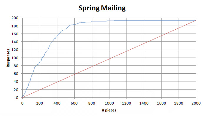
Lift Charts
Lift charts are designed to show the effect that employing the model will have. In essence, it shows the responses taken if you start with the highest scored people first. Here’s how you can look at it. In the embedded chart, the straight line represents the control (your normal responses when no model is used). If you mail everybody in your file, you will get 100% of the responses that you can expect. If you mail 50%, you will receive 50%. In this case, if you mail all 2,000 in your file, you can expect 200 returns, or if you mail 1,000, you can expect 100 returns.
In applying the model, you can see the lift by focusing on the highest scoring people first, you can achieve approximately 180 out of the total 200 responses by only mailing 500 people, or 197 out of 1,000. This means that you can achieve your revenue potential by only mailing 25% of your targets, increasing your net.
Conclusion
Utilizing predictive analytics is designed to allow organizations to make smarter decisions about how to spend resources. By targeting those that are most likely to respond, you can capture the majority of your available revenue at a lower cost, allowing you to take the leftover resources and throw a party – or invest in other fundraising campaigns – but I suggest the party. This basic primer will hopefully introduce to new fundraisers how models can help increase the efficiency of your organization by using all of the data you work so hard to collect.